From the River to the Sea — Illustration for Palestinian Liberation

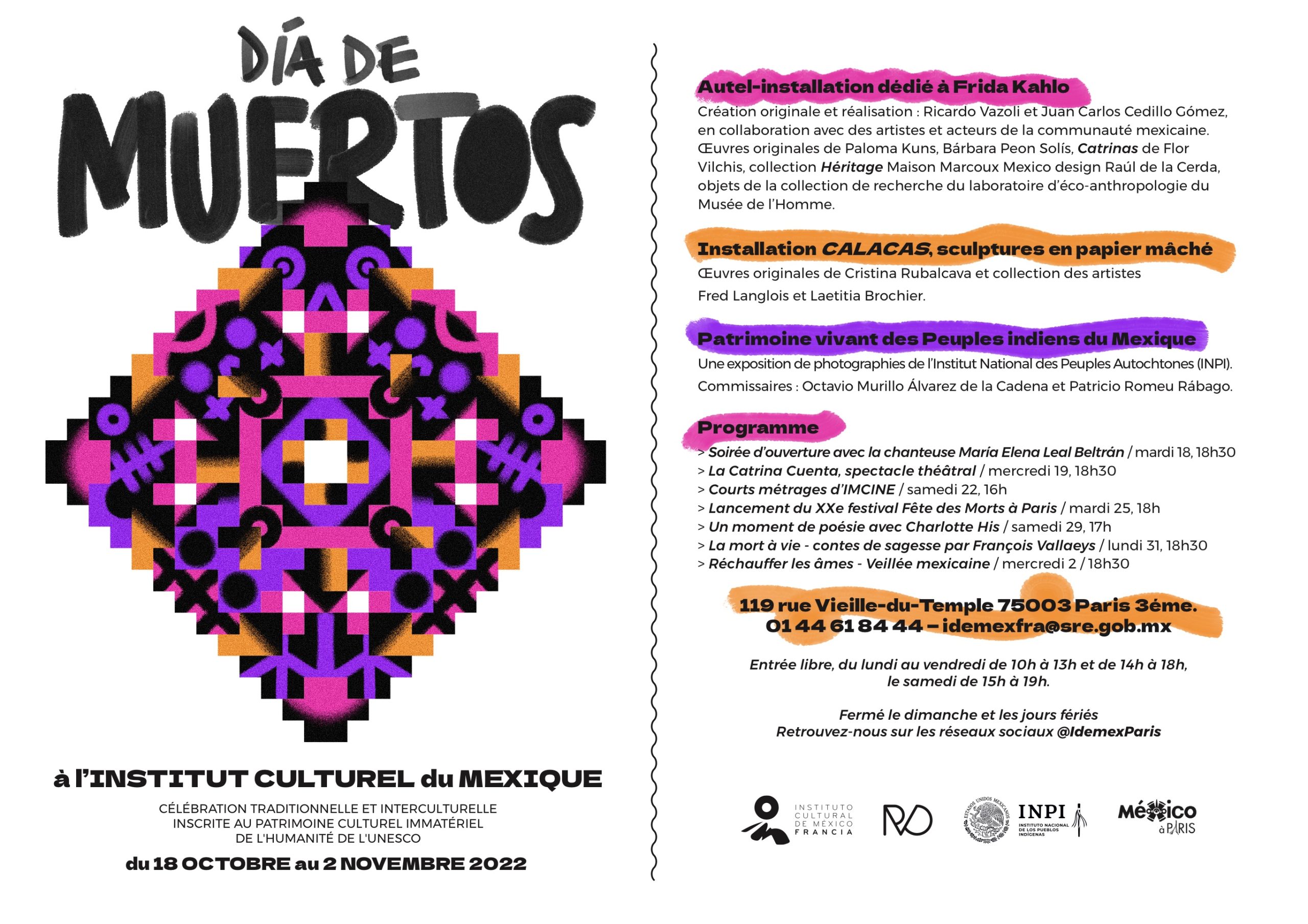
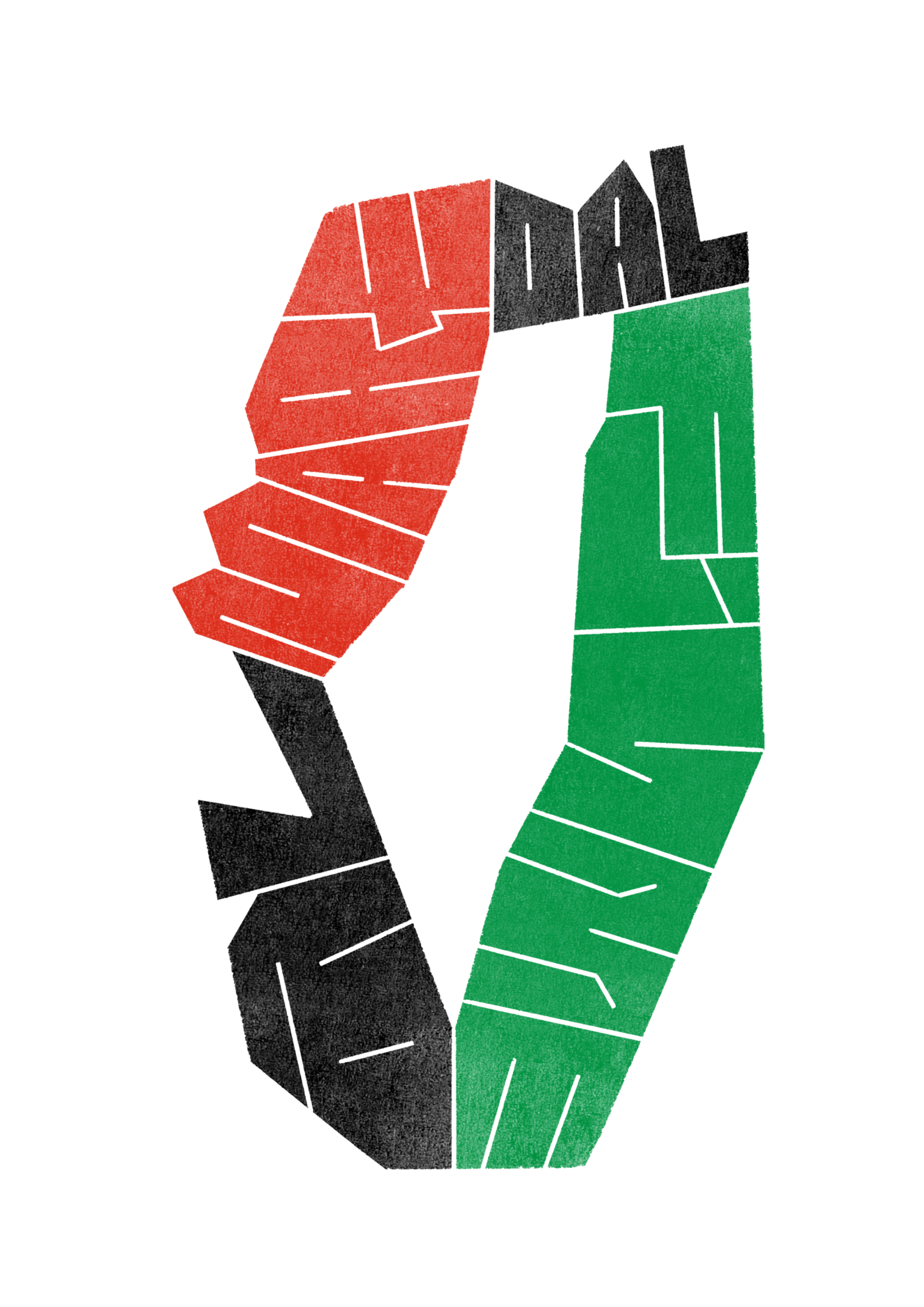
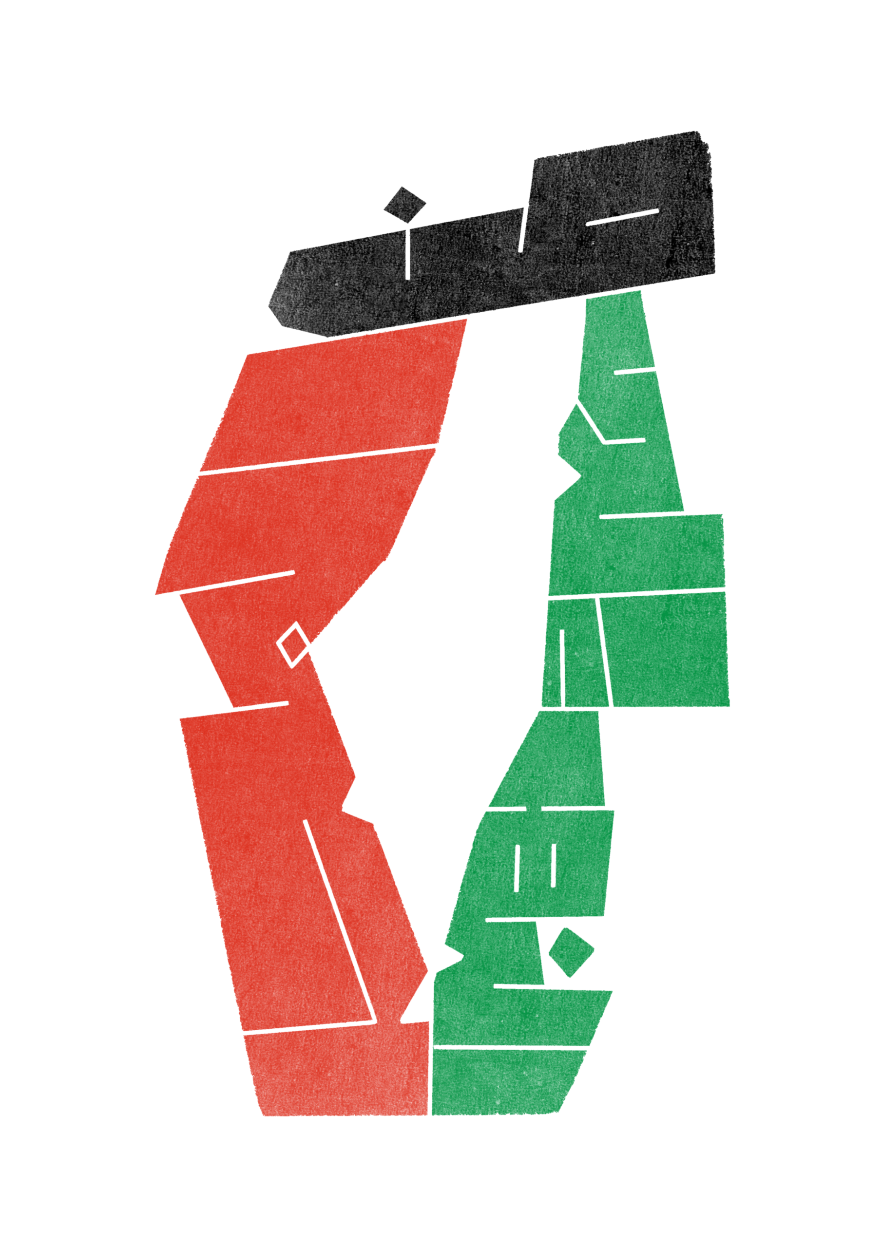
Inspired by the rallying call of the phrase from the river to the sea, I wanted to express that idea visually and began experimenting with blocky letterforms reminiscent of the protest signs used during the Civil Rights Movement in the US and the anti-apartheid demonstrations of the 1980s.

The phrase is not only evocative of a very specific place—the territory historically occupied by Palestine—but also of a time before the Nakba, when the Palestinian people weren’t subjected to an illegal occupation. After the 7/10 insurrection in 2023, the world has opened its eyes to the horrors Palestinians have endured since 1948. At the beginning of the escalation, I created a Ceasefire Now poster for a local demonstration in Strasbourg, but something clicked in my head when I began to reflect on this slogan that is now synonymous with the cause for Palestinian liberation.

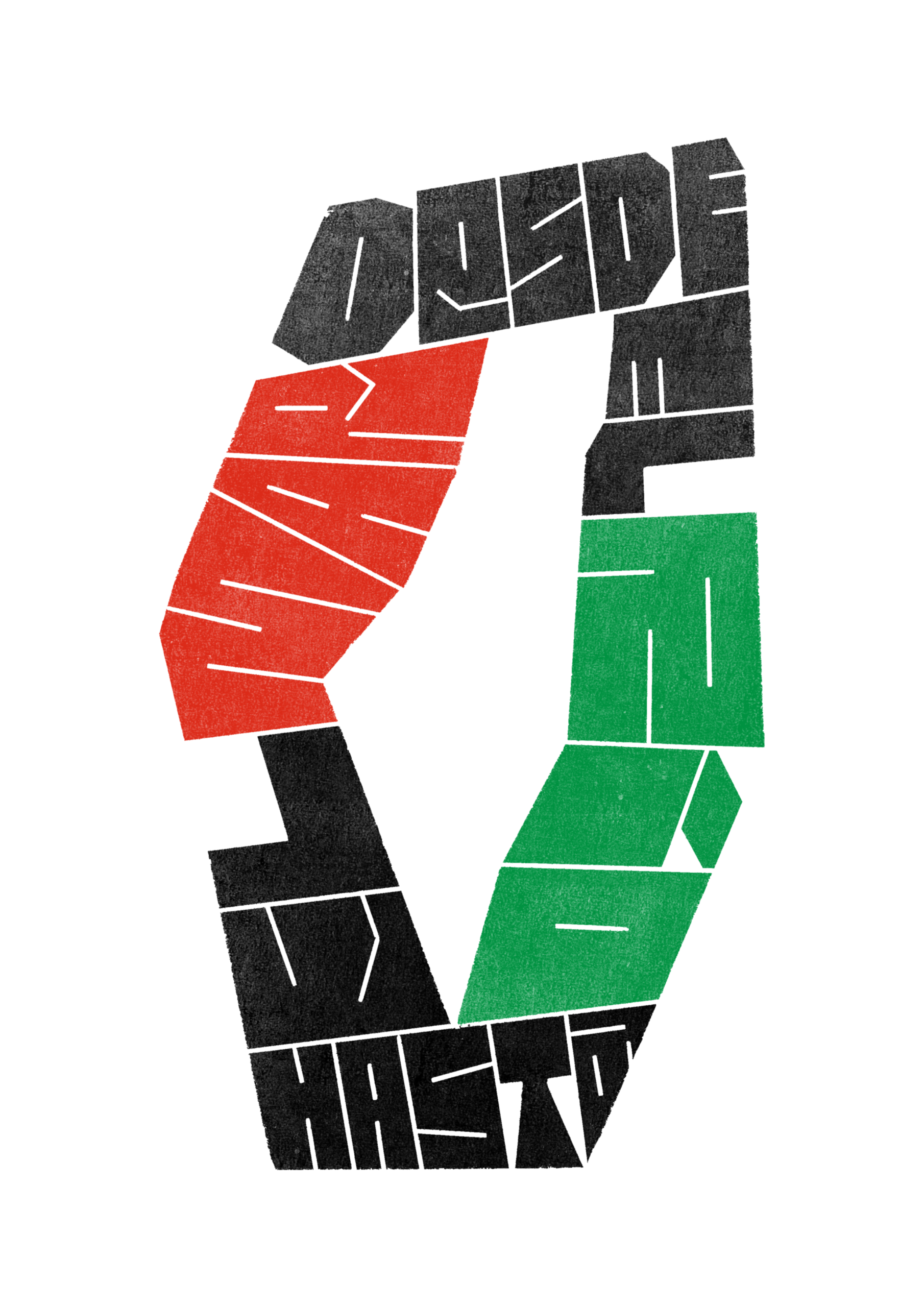
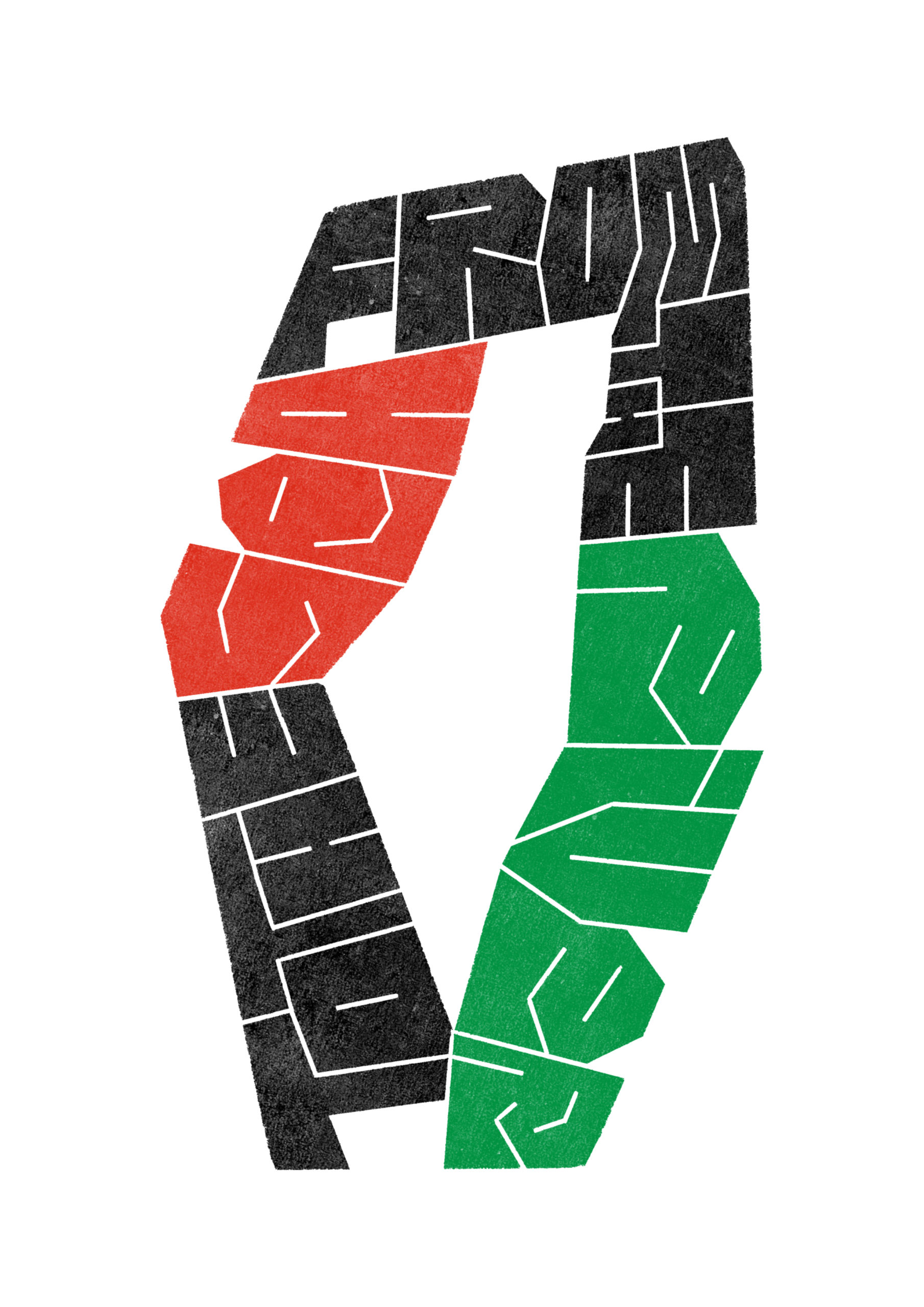
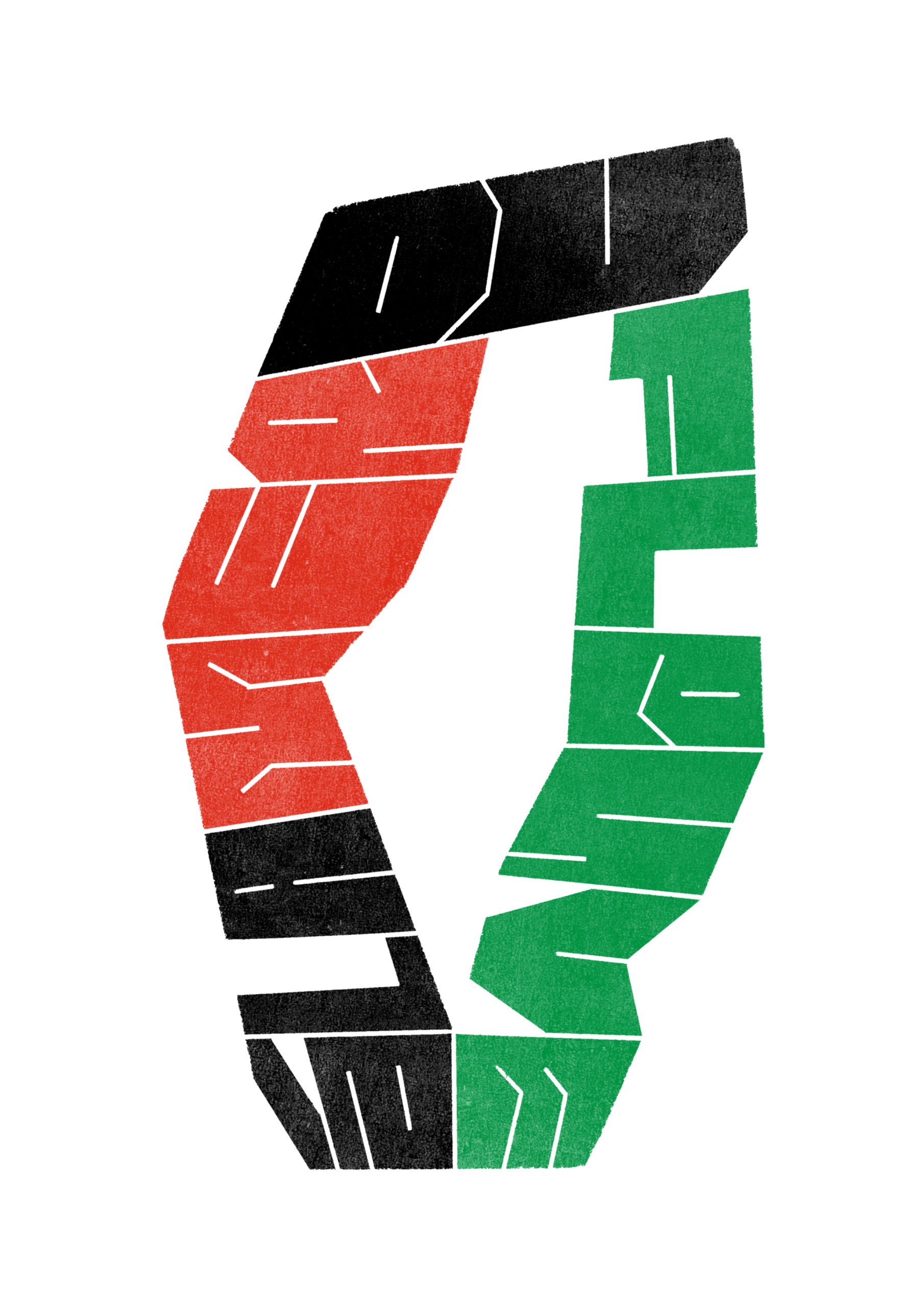
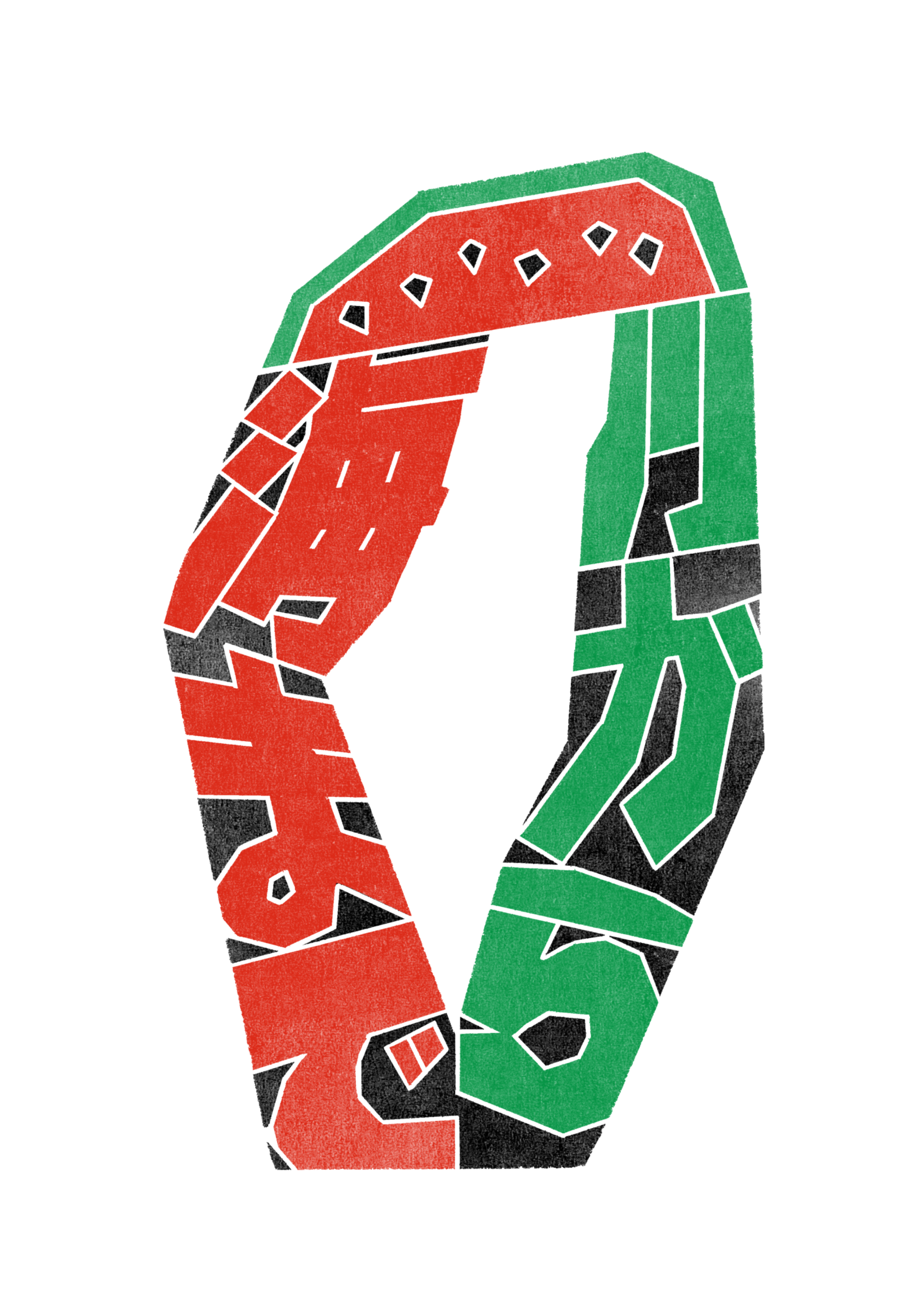
The words river and sea are written relative to the geographical location of the river Jordan and the Mediterranean Sea, while the sentence encloses the Palestinian historical territory and reveals it in negative space. The illustration was originally created in English, but after finding the correct translations of the phrase, I created different versions in Spanish, French, Italian, Japanese, and Arabic.

This project serves not only as a visual representation of a powerful slogan but also as a call to remember and honor the historical context and ongoing struggles of the Palestinian people. By translating the phrase into multiple languages, I aim to spread awareness and solidarity across different cultures and communities worldwide. The art is more than just a piece of visual expression; it is a testament to the resilience and enduring spirit of a people who continue to fight for their rights and freedom. Through this work, I hope to inspire others to join in the cause for justice and peace, and to keep the conversation alive, from the river to the sea.

High-resolution files are available on request by email at hello@vazo.li under a Creative Commons License.

This typography marathon started 10 years ago in Barcelona by Nina Sans and Rafa Goicoechea as a way to create a new letterform everyday, one per letter of the alphabet. A decade since, 36 Days of Type has become a design challenge with thousands of daily entries that go from traditional typographic stylings, calligraphy and manual lettering to vector and motion design.

For me it was a first, not only in creating something new in such a short period of time, but also tackling type and characters head on. I exclusively used Procreate and drew each of the characters manually. Admittedly and since it was my first project of the sort, the visual style varies greatly from day to day, but the overall look remains that of screen printing with transparency. Sometimes I was inspired by blackletter, other times by isometric shapes or even pixel art. The learning curve was steep, but the end result is massively rewarding.

Cambio Natural

Year: 2022 / Client: Cambio Natural / Tools: Procreate, Illustrator, Photoshop, InDesign

After months of planning and developing its learning and marketspace platform, Cambio Natural approached me to create a visual identity encapsulating the organisation’s principles of social innovation for Planetary Health.

Along with César Jerónimo Esquinca, CN’s co-founder, we poured over graphs on global greenhouse gas emissions, the economic impact of climate change and scientific papers on possible solutions to the ongoing environmental crises. After sharing our insights and ideas in several online meetings over the summer of 2022, we arrived at the conclusion that is now Cambio Natural’s modular emblem.

The starting point is the Earth itself, with its near-spherical shape acting as a vessel that contains four different layers, recreated with hand-drawn patterns:

      • Nature. Both the oceans and the atmosphere look blue; they’re the most vulnerable to our gas emissions and without them, Earth would be lifeless.
      • Economy. The value of gold has been intrinsic to the development of the modern economic system. However, the current models are incompatible with a warming planet and will have to adapt to the needs of a society that is already affected by climate change but still refuses to shift its interests on the macroeconomic scale.
      • Technology. Our energy demand has only increased since the invention of the silicon-based microchip and the future of our species depends on the research and development of cleaner energy sources, carbon-capturing devices, sustainable agricultural & industrial models, and robust, universal healthcare with advanced therapies. 
      • Community. When compounded, changes on an individual scale will determine the requirements of a society that is increasingly aware of how the ongoing planetary crises affect the economy, our technological advances and our quality of life. With proper access to education, transparency in science communication and a fair distribution of wealth, society can thrive without compromising the environment on which we all depend.

The emblem, like the Earth or a living cell, is irregular and ever-changing, so the position of the layers and their rotation angle is variable in every major application of the visual identity. For the typographic element, I use Dela Gothic One, a freely available, open-sourced Google Font.

Histoires de Statues at Lieu d’Europe

Year: 2022 / Client: Lieu d’Europe / Tools: Procreate, Photoshop, InDesign

In the summer of 2021, the city of Strasbourg had several 18th-century statues relocated to the gardens of Lieu d’Europe, a cultural centre located near the Council of Europe and the European Parliament, that is dedicated to the history of the European Institutions that call Strasbourg home. The history behind the statues is not well documented, but what little we know of them is that they represent the natural elements: fire, earth, air and water. But the most important pieces are the pieces inspired by the two most important rivers in the region, the Moselle and the Rhine.

To invite the thousands of children that visit the gardens every year to discover these statues, Lieu d’Europe invited me to illustrate a booklet with games and activities.

Watercolour was the main medium for the project, as the theme behind the two main statues is water. It was also important to invite the children to discover the garden subtly, so the actual plot of the land where Lieu d’Europe stands served as the cover for the booklet.

The booklet had to be made available in French, German and English, the three most prominent languages in Strasbourg, as Lieu d’Europe welcomes visitors from all over the region.

You will notice that the cover resembles the layout of the gardens with the main building’s relative position to the trees and the paths within it. But there are hints too, that guide the visitors and a few Easter Eggs. The trees in multicoloured trees represent the passing of the seasons and also the diversity of peoples and cultures in Europe, but not only that! There are a few spots in orange with triangles on top of them because the cover is also a map!

Next to each statue on the booklet, there’s a triangle—taken from the alchemic symbols for the elements— to represent them. This way, it’s easier to find the statues in the gardens when using the cover as a visitor’s guide. The light orange colour of the symbols is the actual colour of the stone used to carve the statues 200 years ago, and the elements of each statue define the colour palette used.

The Rhine and the Moselle ask the children to draw the rivers on the map from their sources; the Water Statue asks them to circle the fish that live in the region; the Earth Statue invites them to cross out the animals that are not native to the river basins; and finally, Vulcan wants them to match the name to the volcanoes across Europe.

Histoires de Statues is available for free since June 2022 at Lieu d’Europe.


Día de Muertos Paris 2022

Year: 2022 / Client: Instituto Cultural de México en Francia / Tools: Procreate, InDesign

After our collaboration in the summer of 2021, the Mexican Cultural Institute in France invited me to create the concept and visual identity for their Día de Muertos 2022 in Paris programme from 18 October to 2 November.

For the identity, and inspired by Aztec mythology, math and time-keeping, I designed a grid with 364 squares, one per day of the Aztec calendar year, displayed in a way that not only could be split into four equal parts—one per season—but also in a top-view perspective of a generic Mesoamerican pyramid.

The colour palette of purple, orange and black, takes from the traditional hues used in the Day of the Dead festivities and the dyed wood saw that is commonly used to create patterns and decorate tombstones is reflected in the illustration’s texture. The passage of time, as well as the duality behind good and evil, night-day, life and death, is the general motif of the illustration. Death lurks in the corner represented by small skulls; there are also flowers and a hidden heart shape in the composition. I use my handwriting for the title and main headers, taking a lot from the urban lettering that covers street food carts and local stores in Mexico.

The installation consists of a photo-based altar, made with 364 paper flowers and placed in the same way as the grid used in the illustration where we’d insert the photos sent in by the Mexican community in France to honour our dead relatives.

Next to it, Juan Carlos Cedillo Gómez set up a traditional Day of the Dead that included patterns made with corn and bean grains, paper-cut art and food items, which was dedicated to Frida Kahlo. Hanging on the wall above, seven different symbols made of paper flowers on 1/4 of the main grid size and inspired by Kahlo’s work, add to the installation. Ingrid Arriaga, Silvia Chávez and Freddy López helped me by prepping the paper flowers and attaching the tableaus to the wall.

For the installation’s brochure, we wanted to make something special and give a copy of the poster for everyone who visited to keep so, I came up with a folded A3 layout to include the programme, the participating artists, the project’s significance and the partners that made this all happen on the front, and a signed copy of the event’s poster on the back. The programme is also decorated with small background illustrations related to the different activities and events. Seven distinctive symbols—femininity, diversity, freedom, sexuality, pain, life & death and creativity—are used to create the brochure’s cover.

Other materials produced include animated slides for the Institute’s Instagram stories and vinyl inserts for the gallery’s entrance and window front.