Día de Muertos Paris 2022
Year: 2022 / Client: Instituto Cultural de México en Francia / Tools: Procreate, InDesign
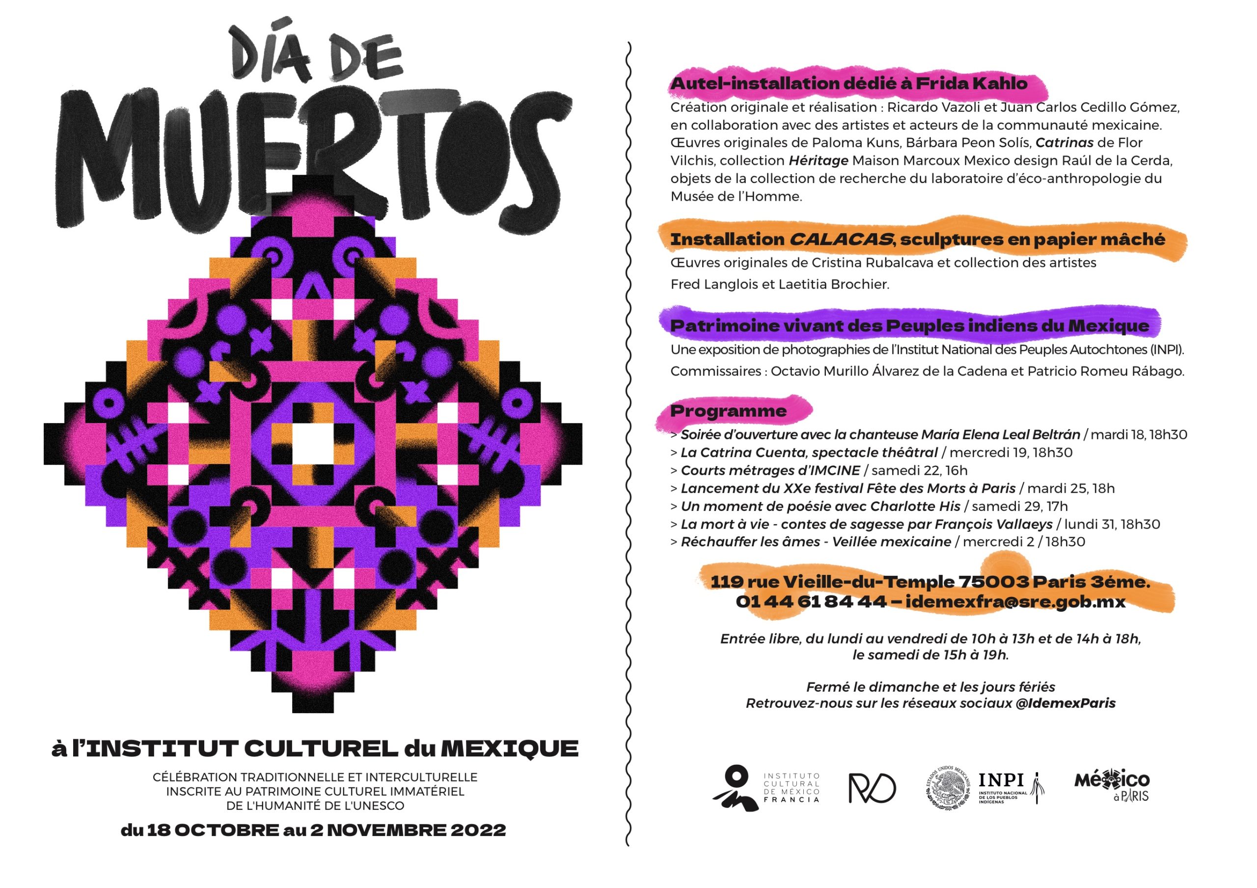
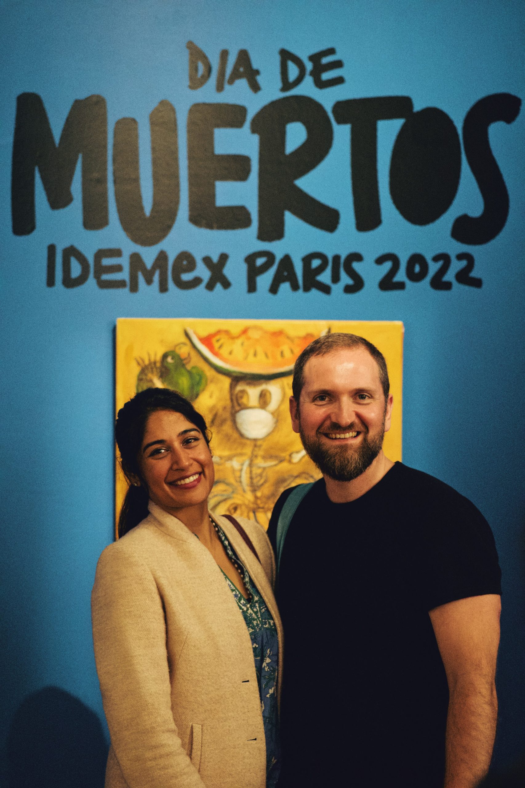
After our collaboration in the summer of 2021, the Mexican Cultural Institute in France invited me to create the concept and visual identity for their Día de Muertos 2022 in Paris programme from 18 October to 2 November.
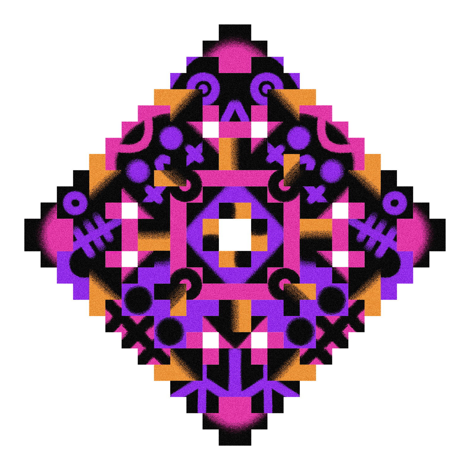
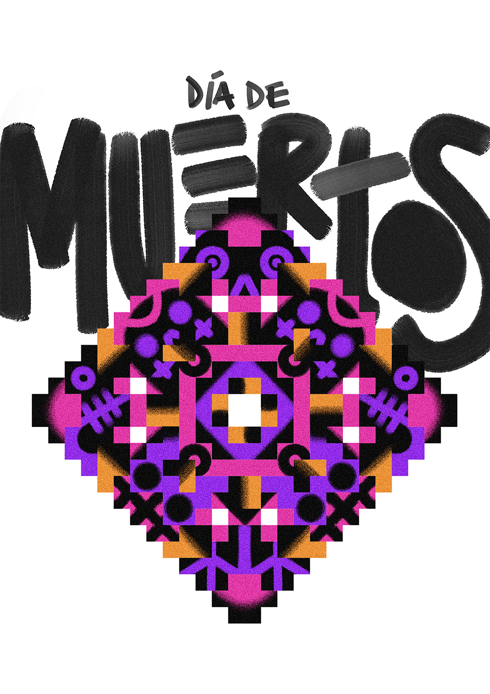
For the identity, and inspired by Aztec mythology, math and time-keeping, I designed a grid with 364 squares, one per day of the Aztec calendar year, displayed in a way that not only could be split into four equal parts—one per season—but also in a top-view perspective of a generic Mesoamerican pyramid.
The colour palette of purple, orange and black, takes from the traditional hues used in the Day of the Dead festivities and the dyed wood saw that is commonly used to create patterns and decorate tombstones is reflected in the illustration’s texture. The passage of time, as well as the duality behind good and evil, night-day, life and death, is the general motif of the illustration. Death lurks in the corner represented by small skulls; there are also flowers and a hidden heart shape in the composition. I use my handwriting for the title and main headers, taking a lot from the urban lettering that covers street food carts and local stores in Mexico.
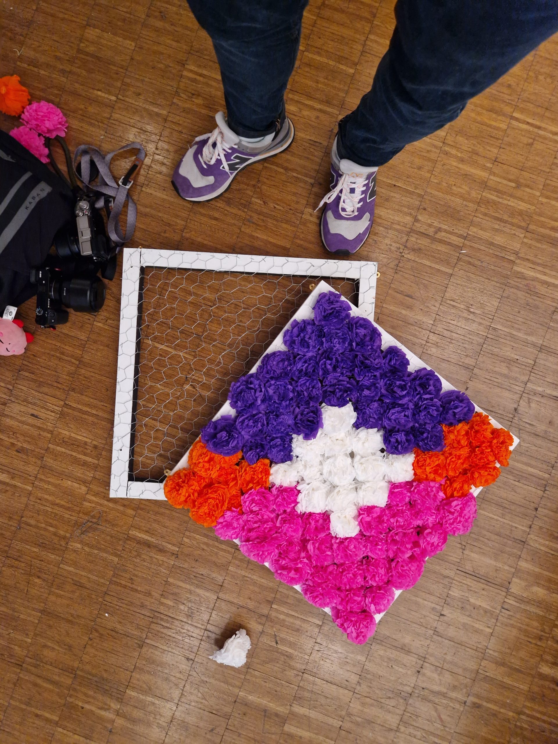
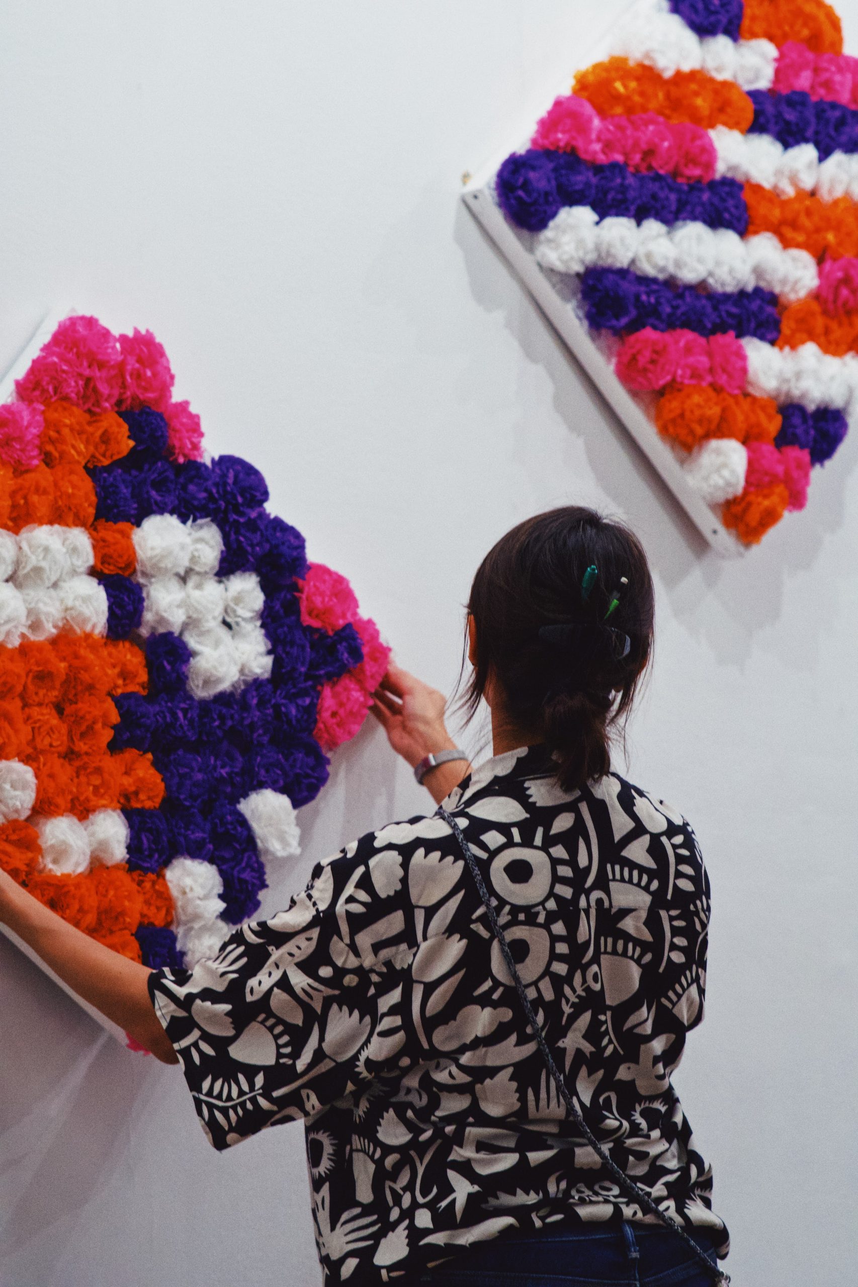
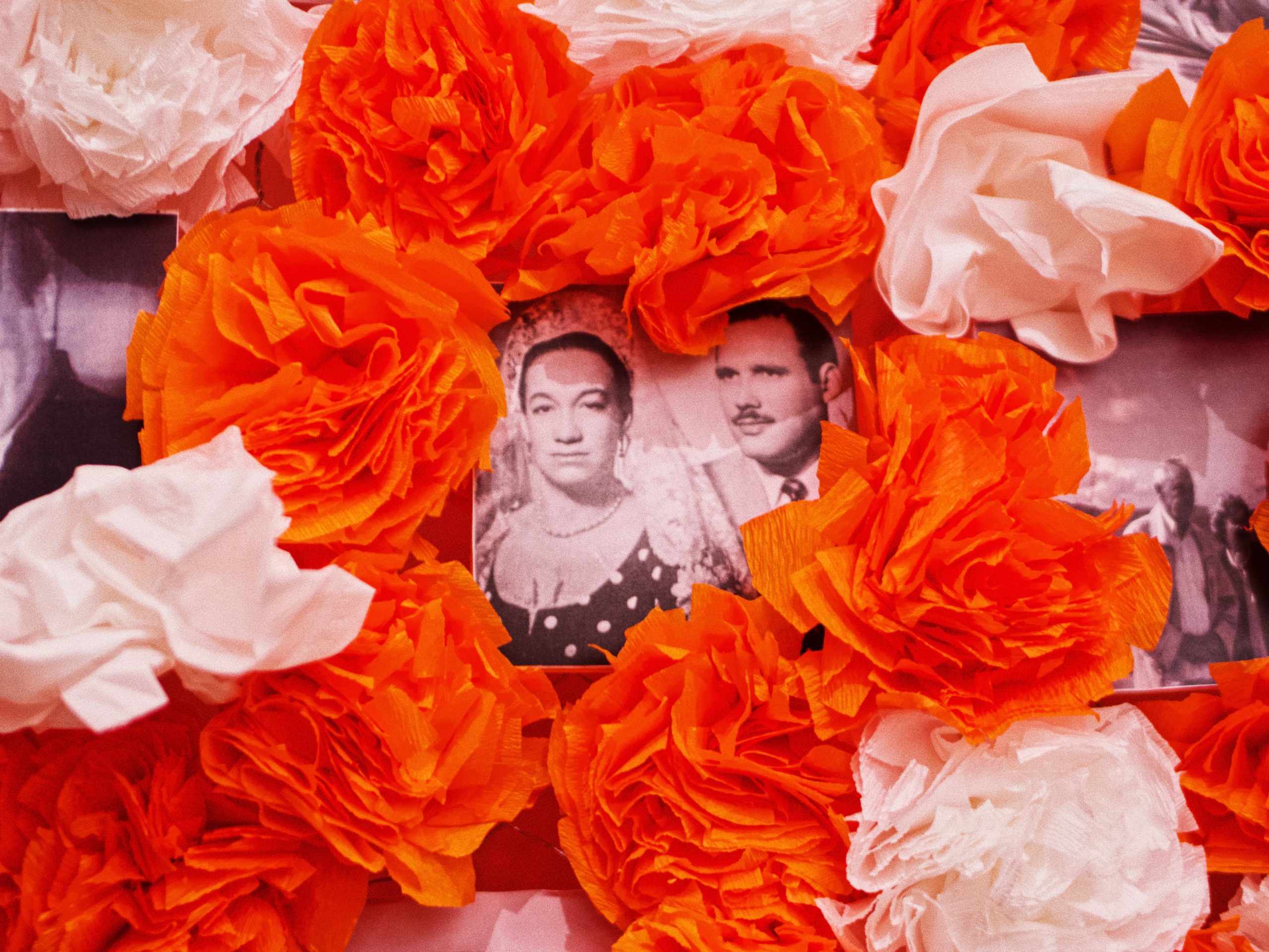
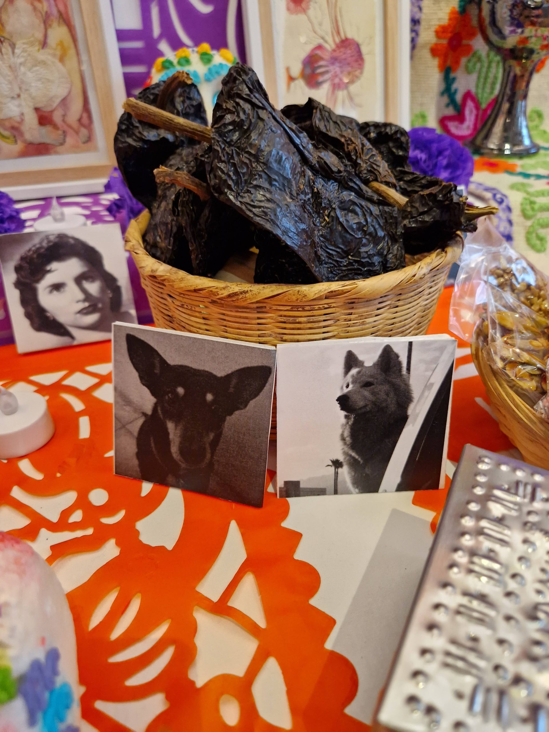
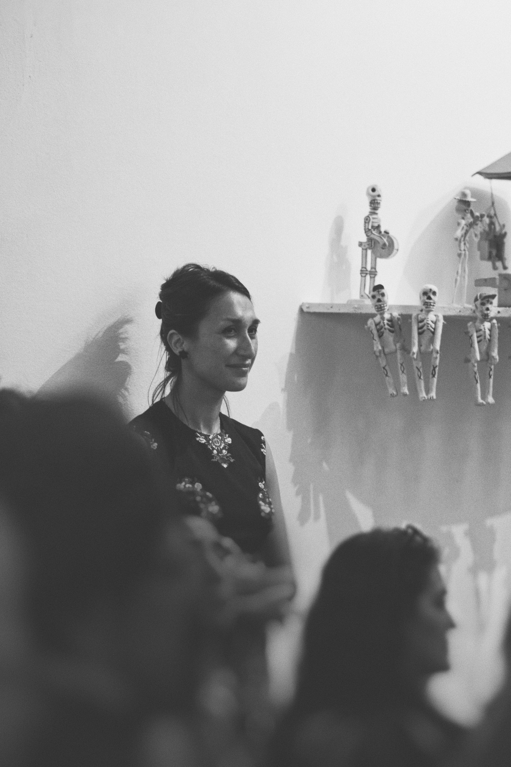
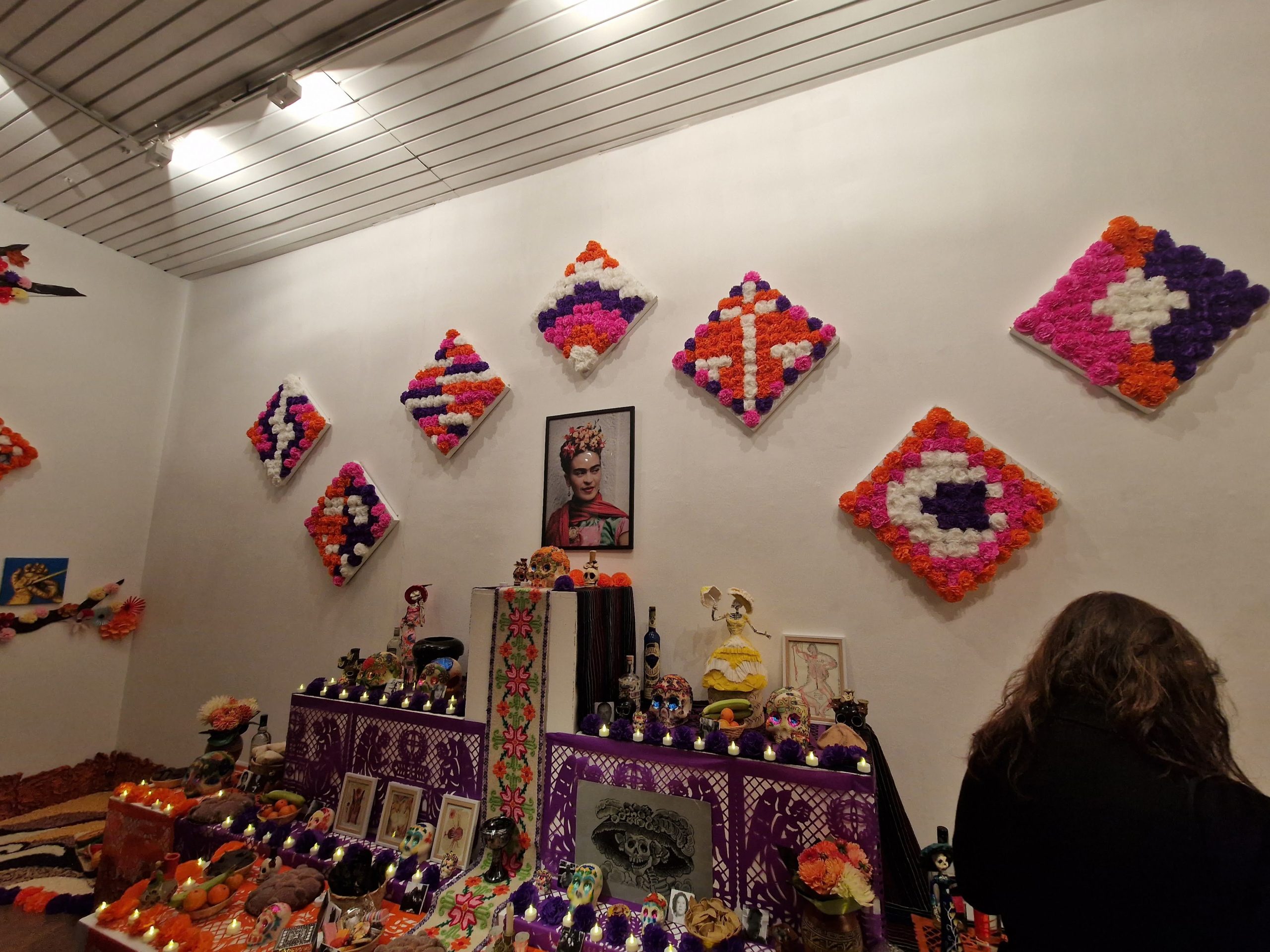
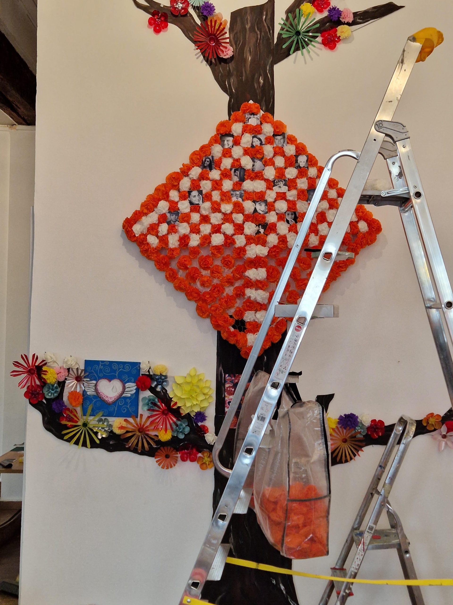
The installation consists of a photo-based altar, made with 364 paper flowers and placed in the same way as the grid used in the illustration where we’d insert the photos sent in by the Mexican community in France to honour our dead relatives.
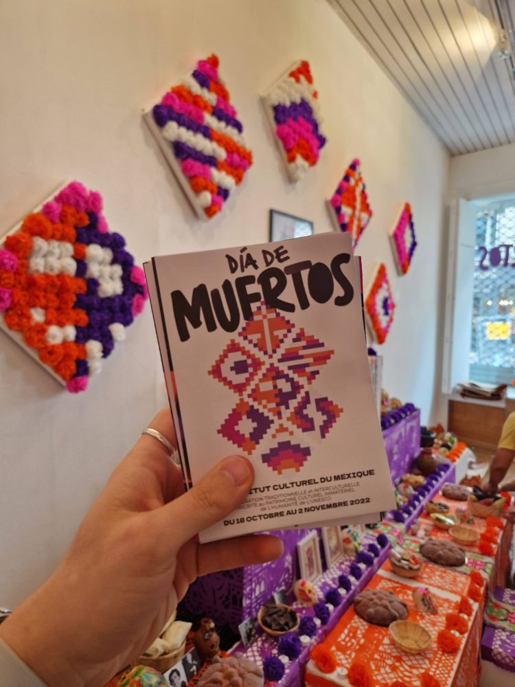
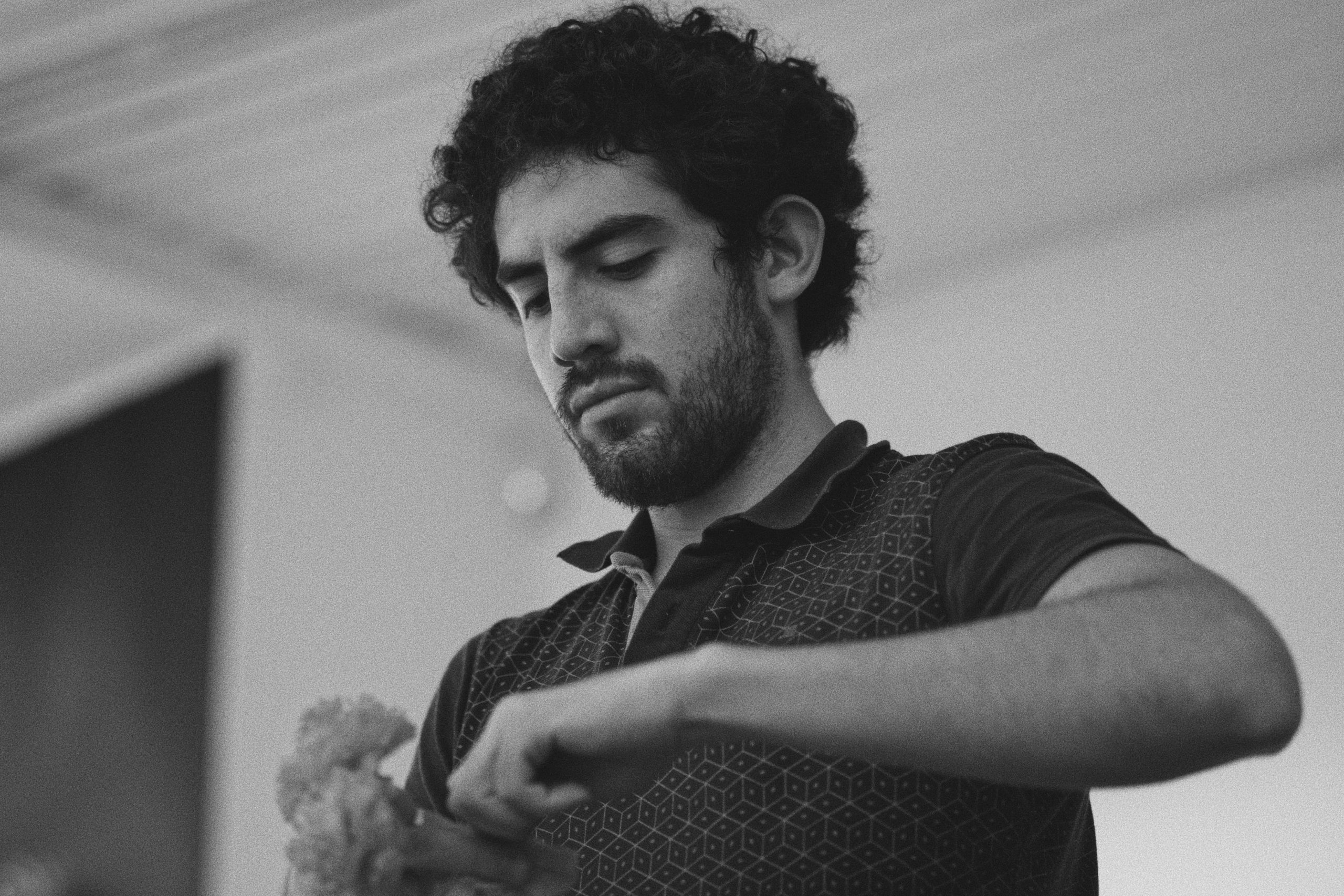
Next to it, Juan Carlos Cedillo Gómez set up a traditional Day of the Dead that included patterns made with corn and bean grains, paper-cut art and food items, which was dedicated to Frida Kahlo. Hanging on the wall above, seven different symbols made of paper flowers on 1/4 of the main grid size and inspired by Kahlo’s work, add to the installation. Ingrid Arriaga, Silvia Chávez and Freddy López helped me by prepping the paper flowers and attaching the tableaus to the wall.
For the installation’s brochure, we wanted to make something special and give a copy of the poster for everyone who visited to keep so, I came up with a folded A3 layout to include the programme, the participating artists, the project’s significance and the partners that made this all happen on the front, and a signed copy of the event’s poster on the back. The programme is also decorated with small background illustrations related to the different activities and events. Seven distinctive symbols—femininity, diversity, freedom, sexuality, pain, life & death and creativity—are used to create the brochure’s cover.
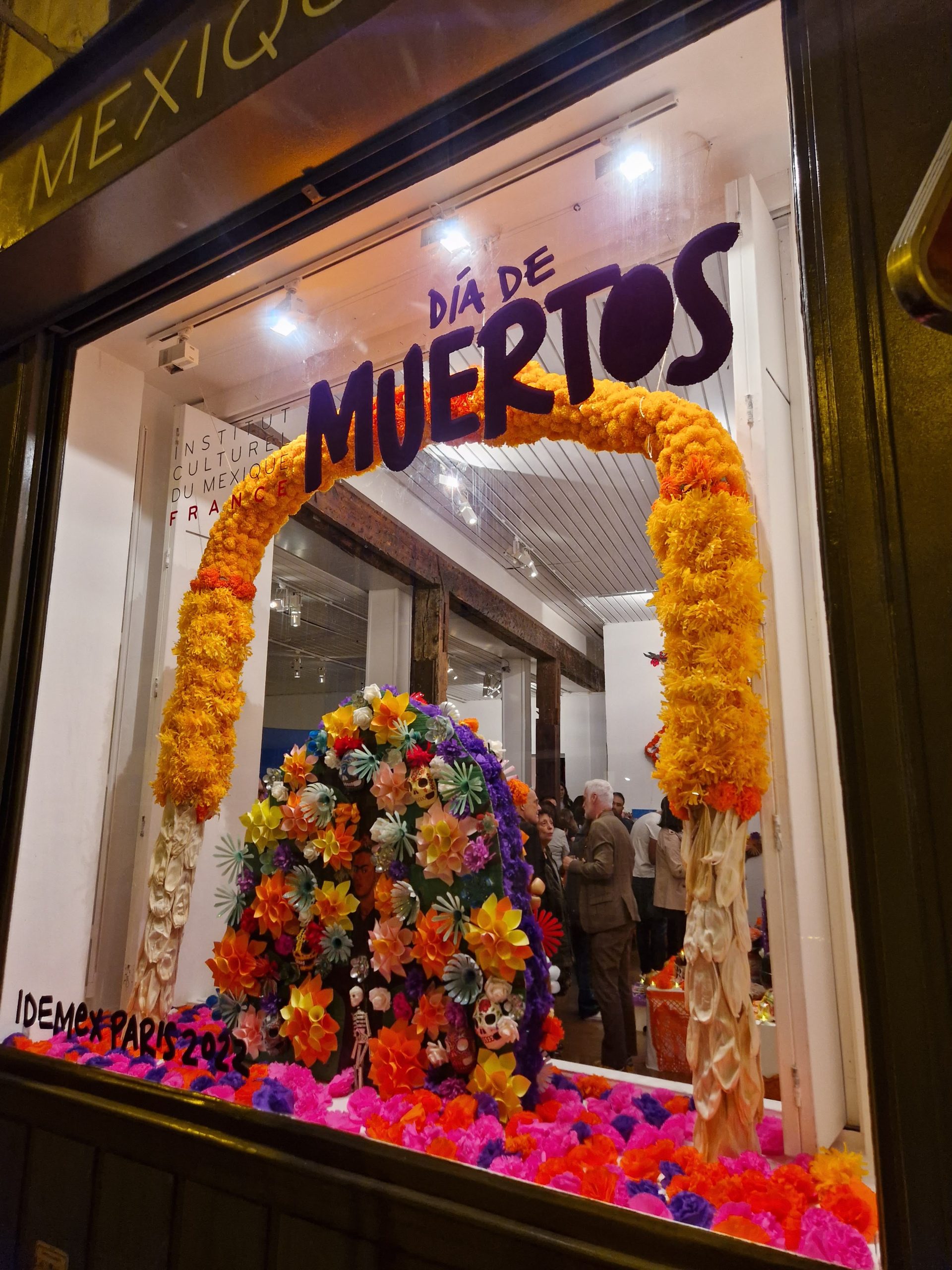
Other materials produced include animated slides for the Institute’s Instagram stories and vinyl inserts for the gallery’s entrance and window front.