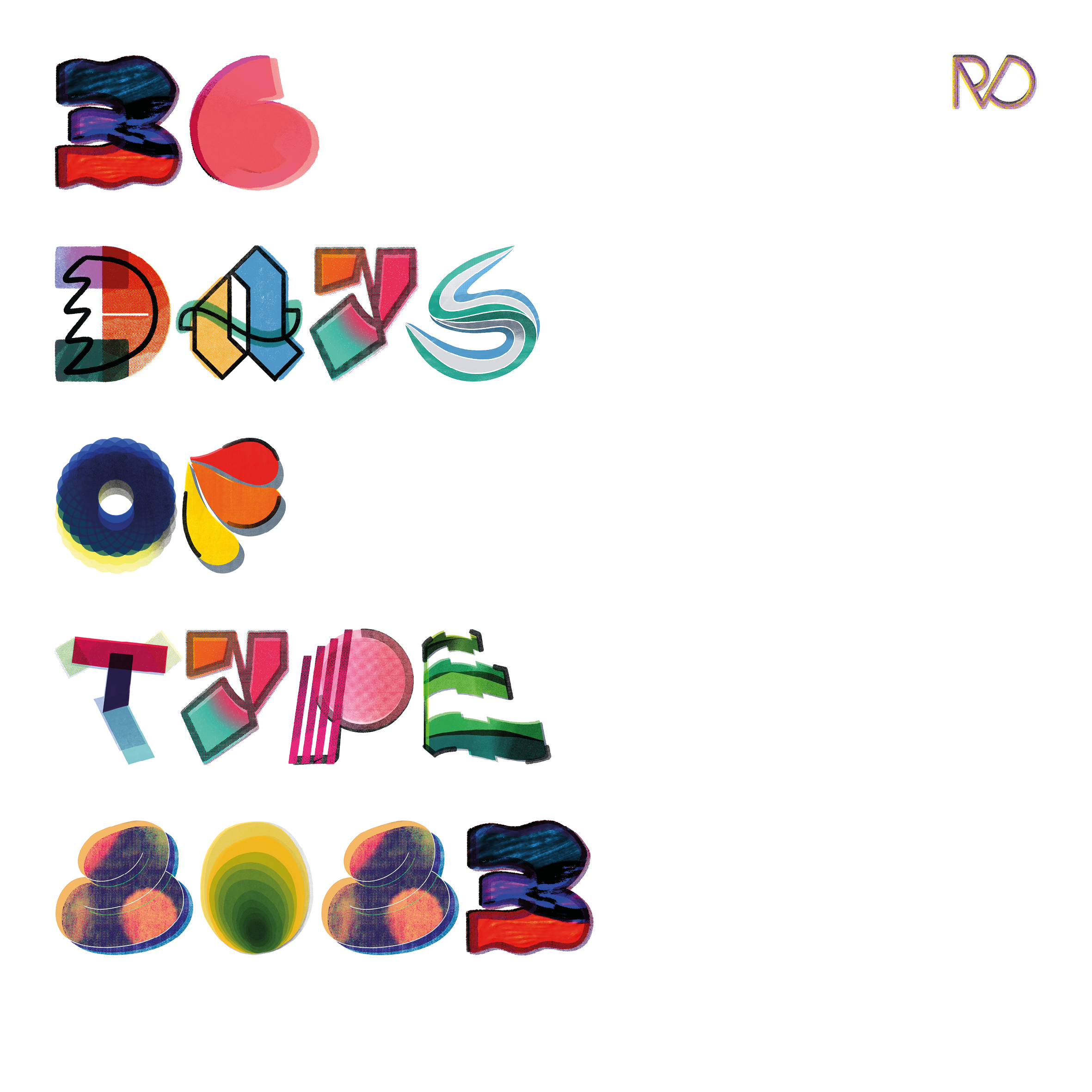
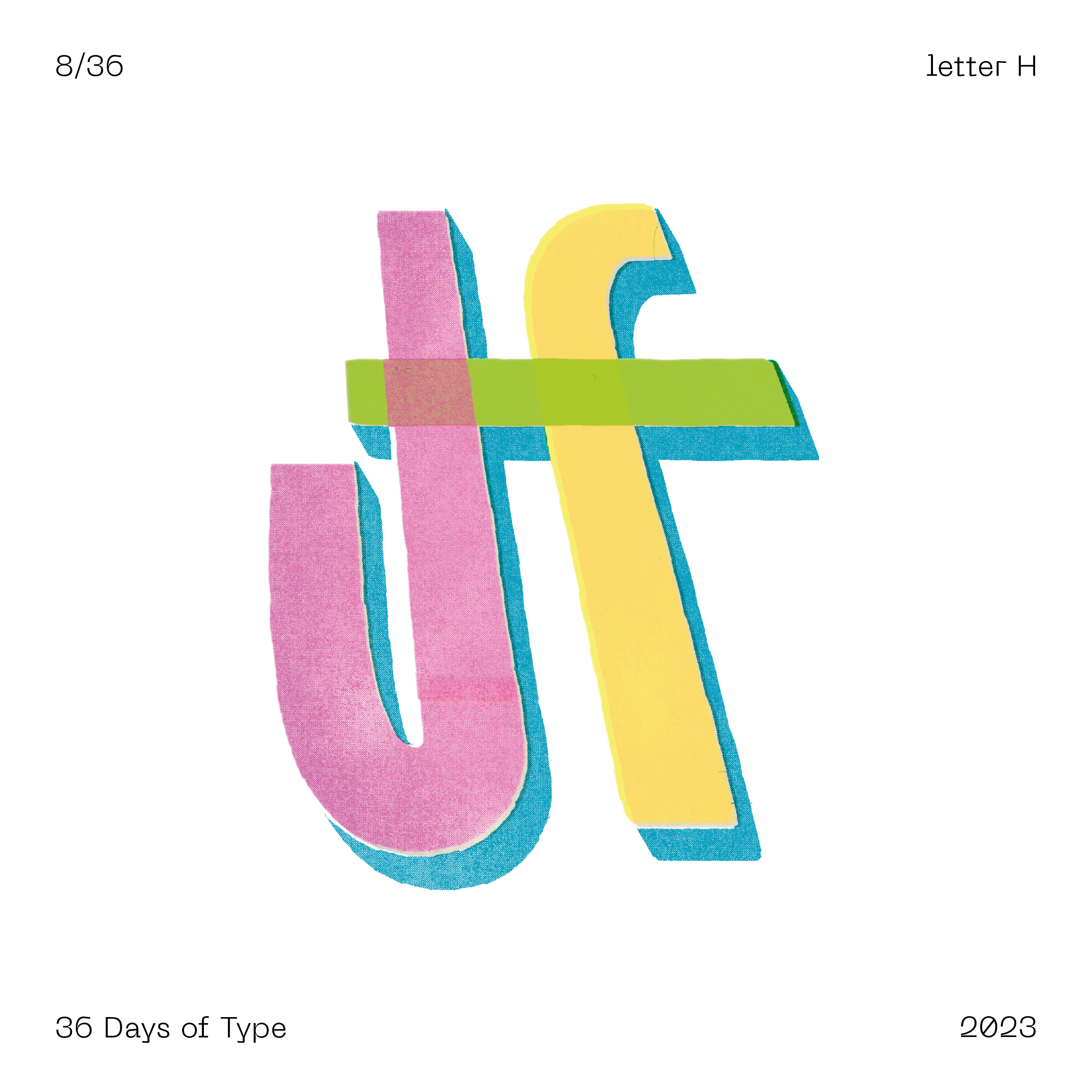
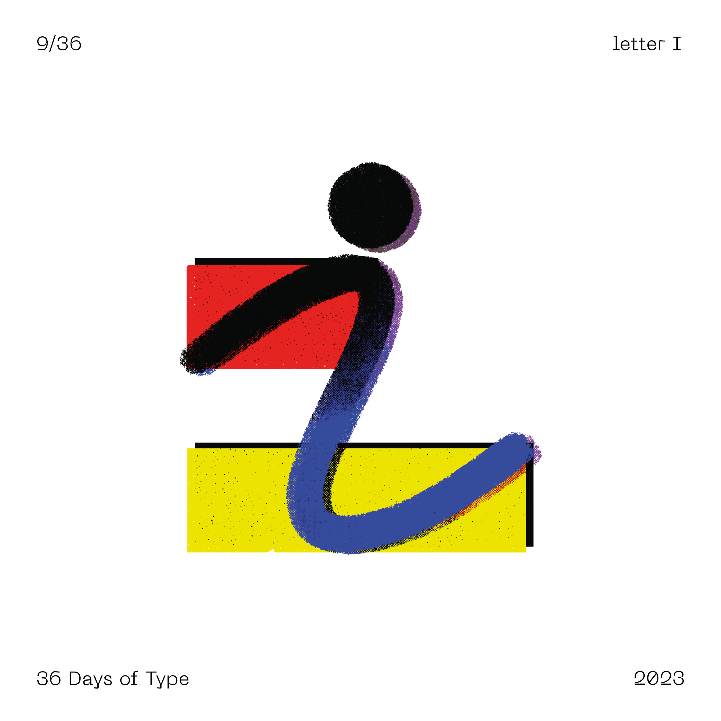
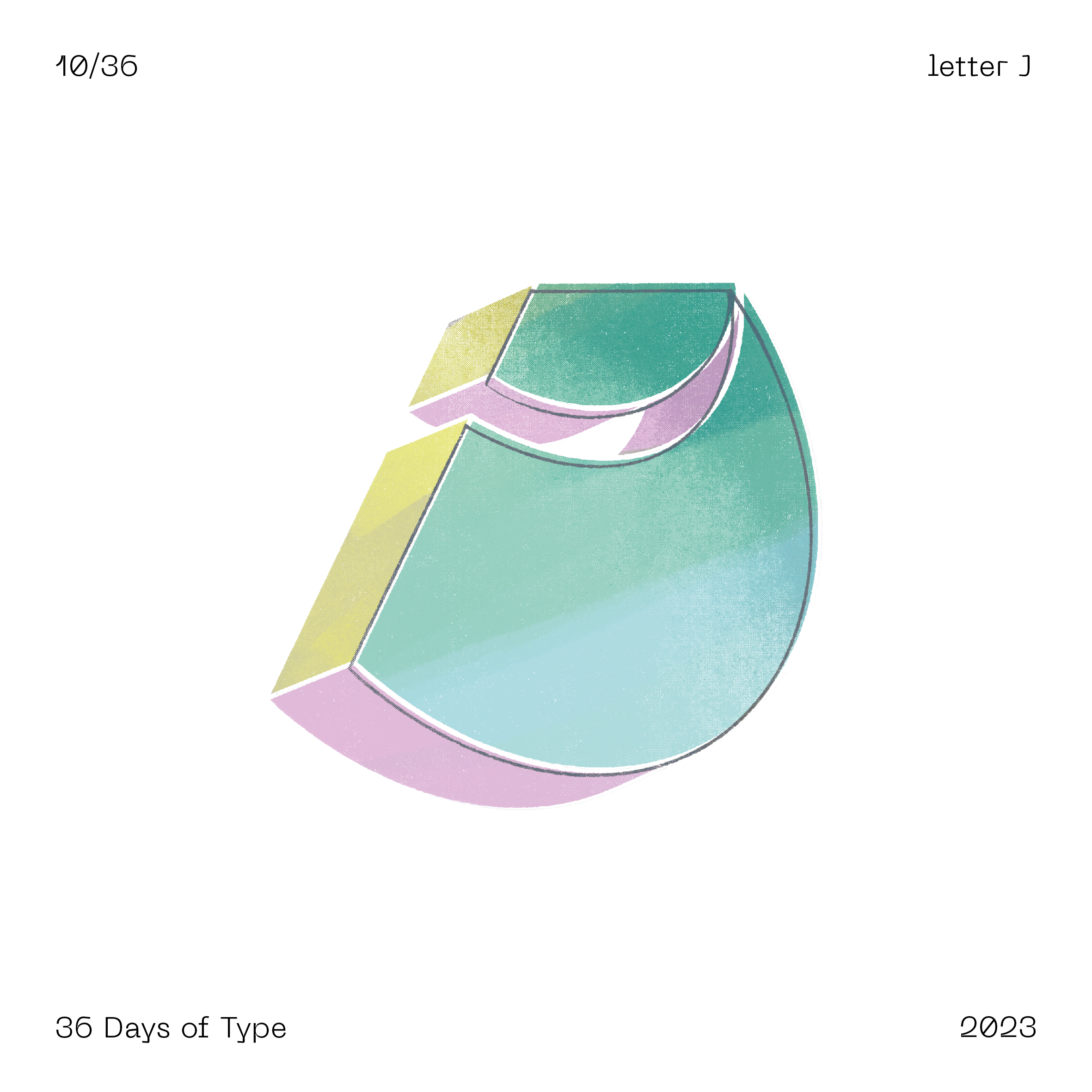
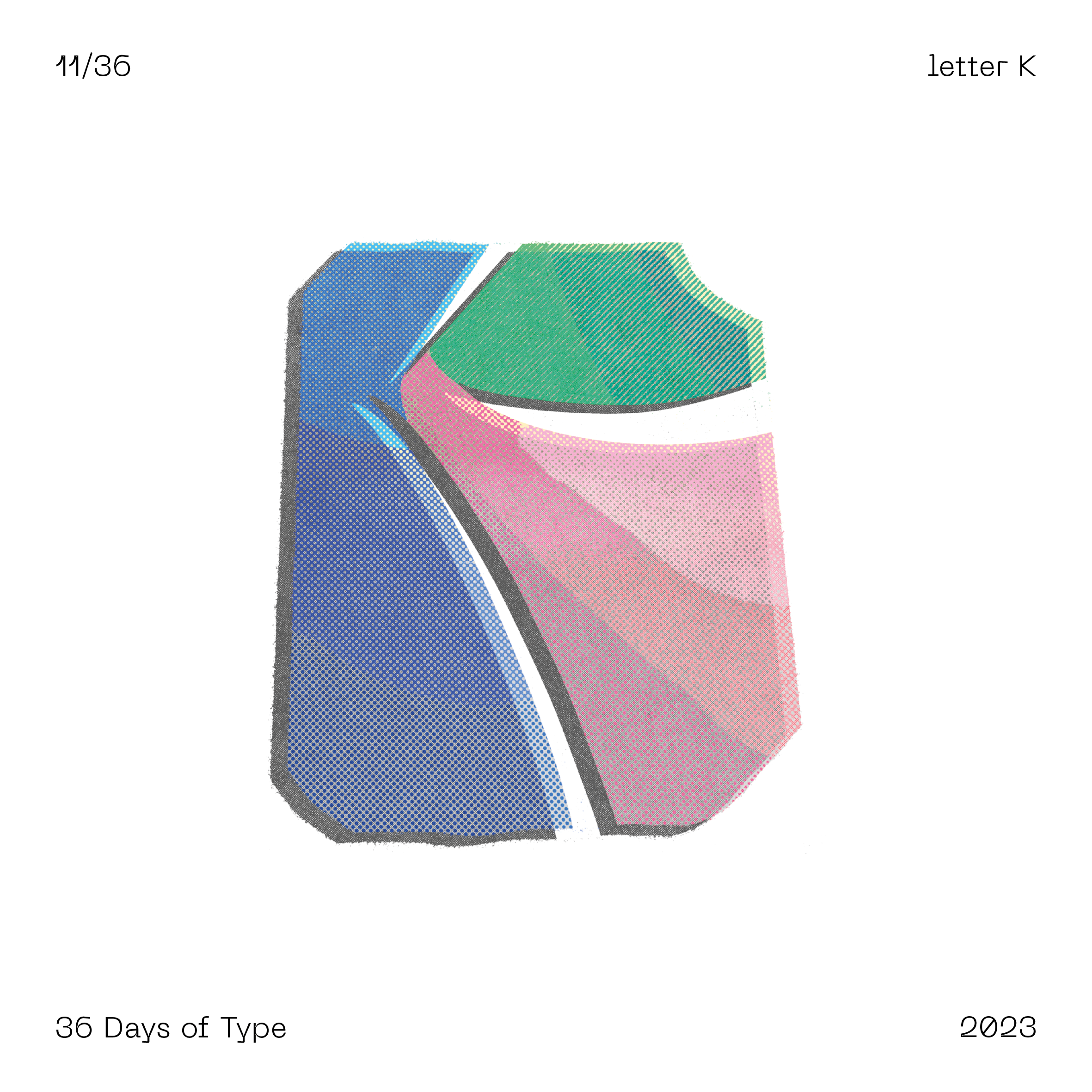
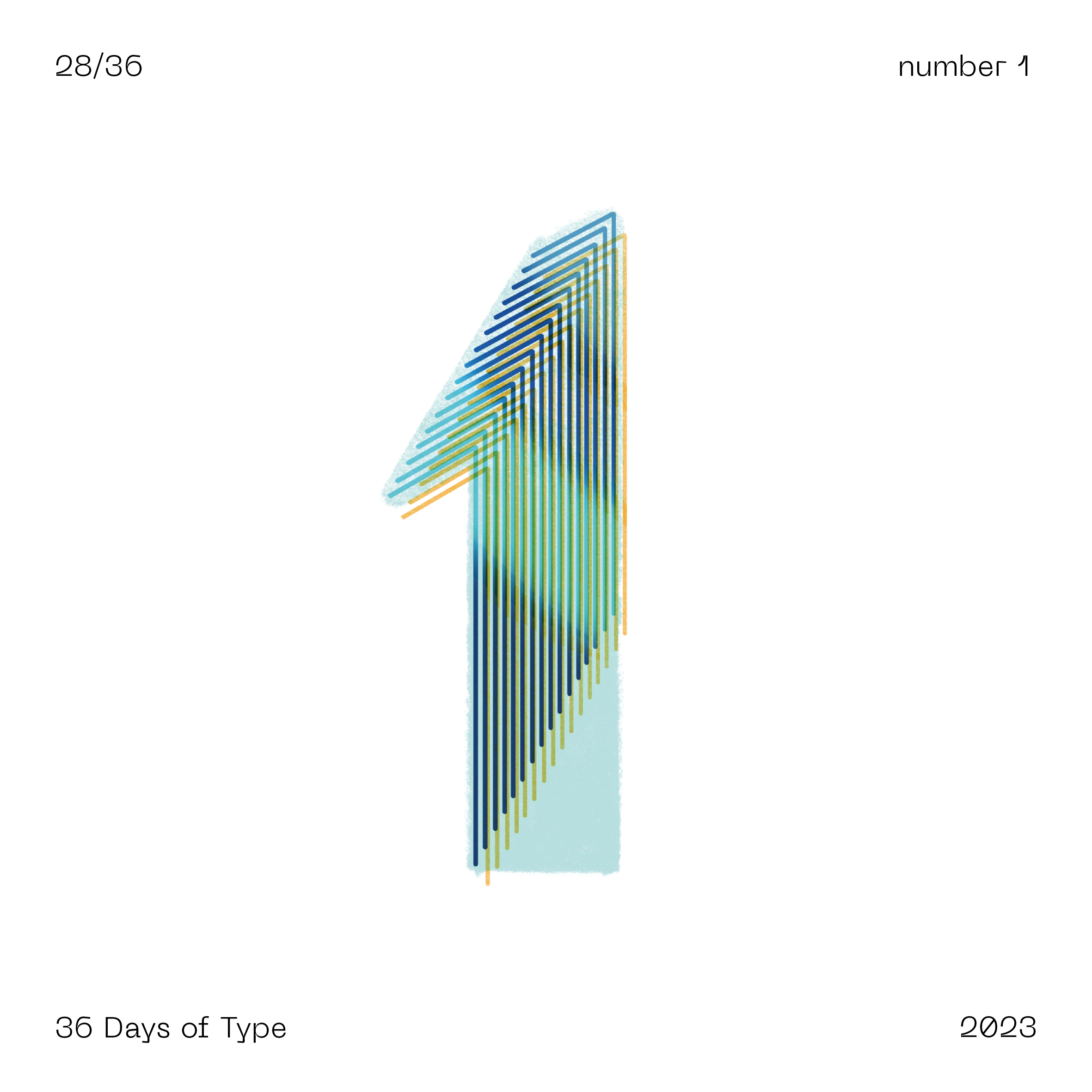
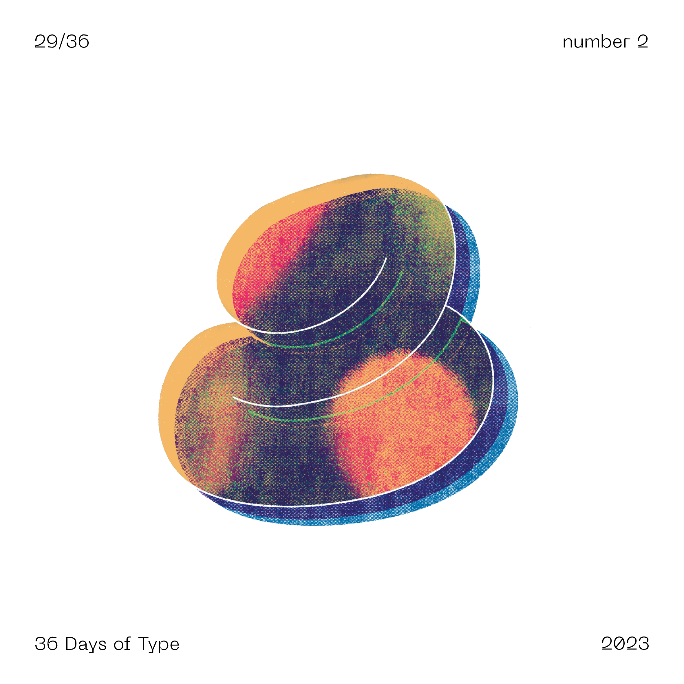
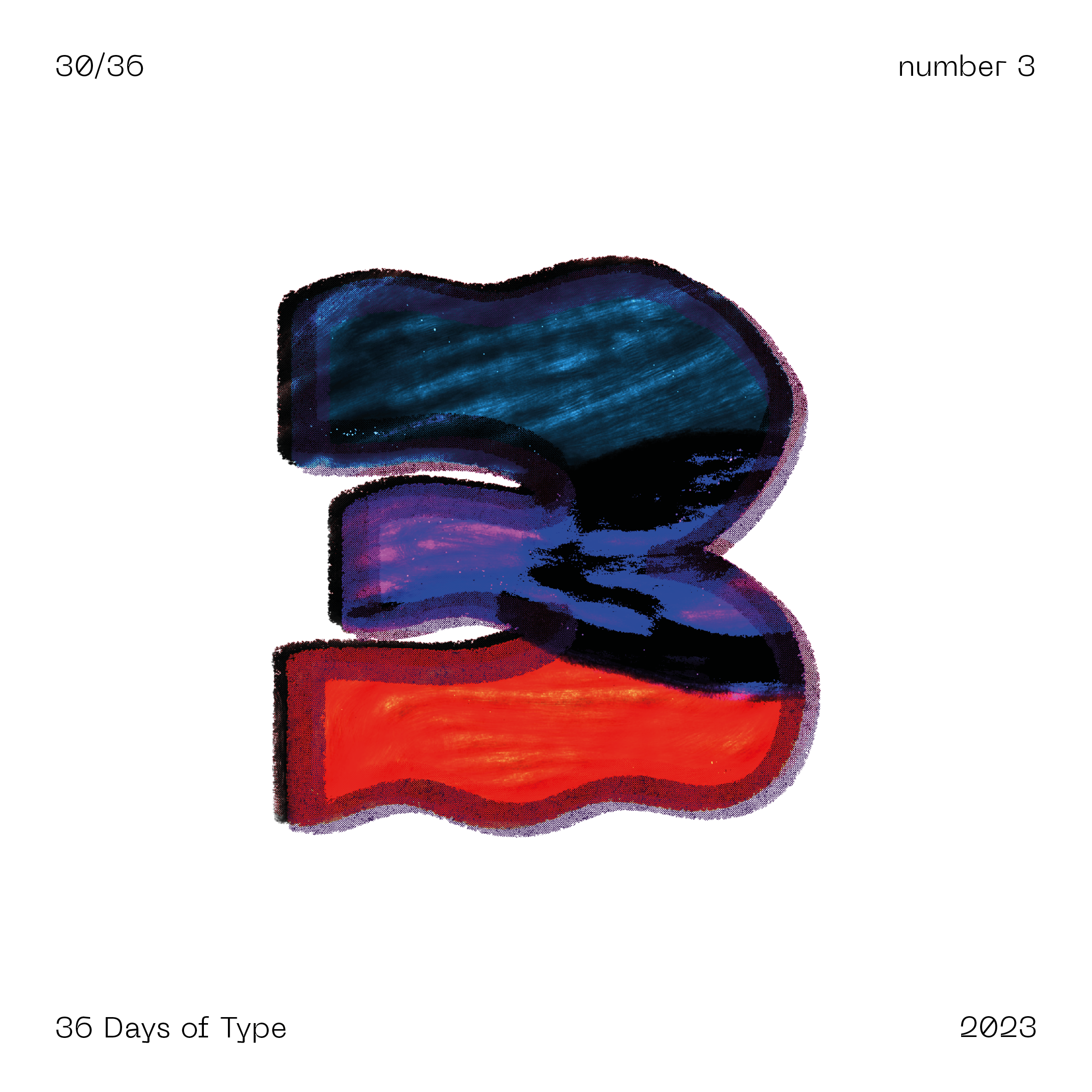
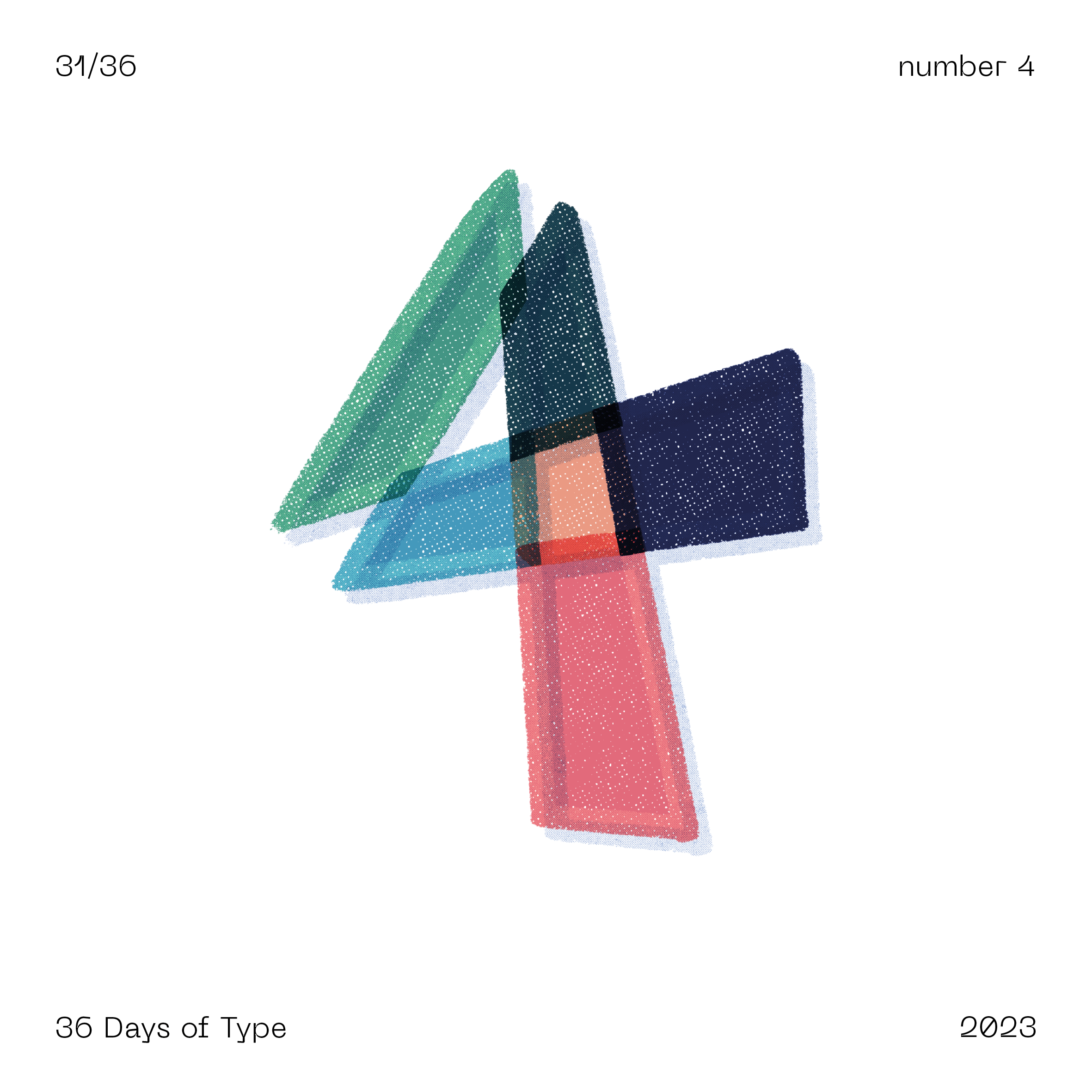
This typography marathon started 10 years ago in Barcelona by Nina Sans and Rafa Goicoechea as a way to create a new letterform everyday, one per letter of the alphabet. A decade since, 36 Days of Type has become a design challenge with thousands of daily entries that go from traditional typographic stylings, calligraphy and manual lettering to vector and motion design.
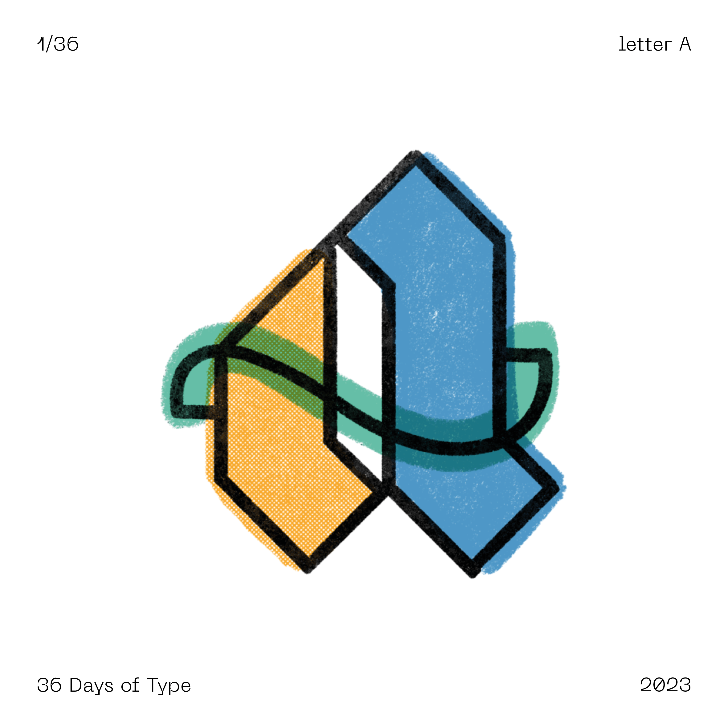
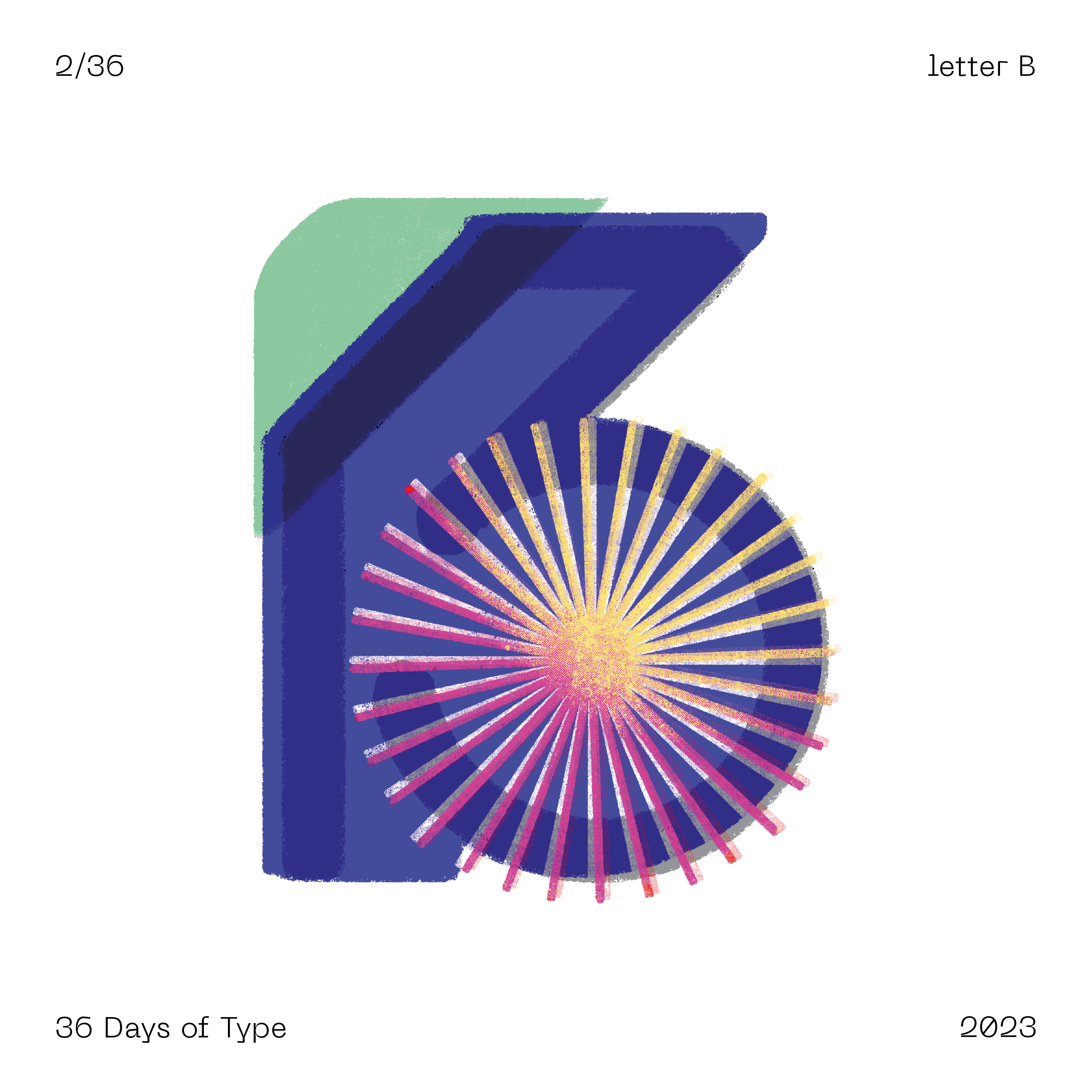
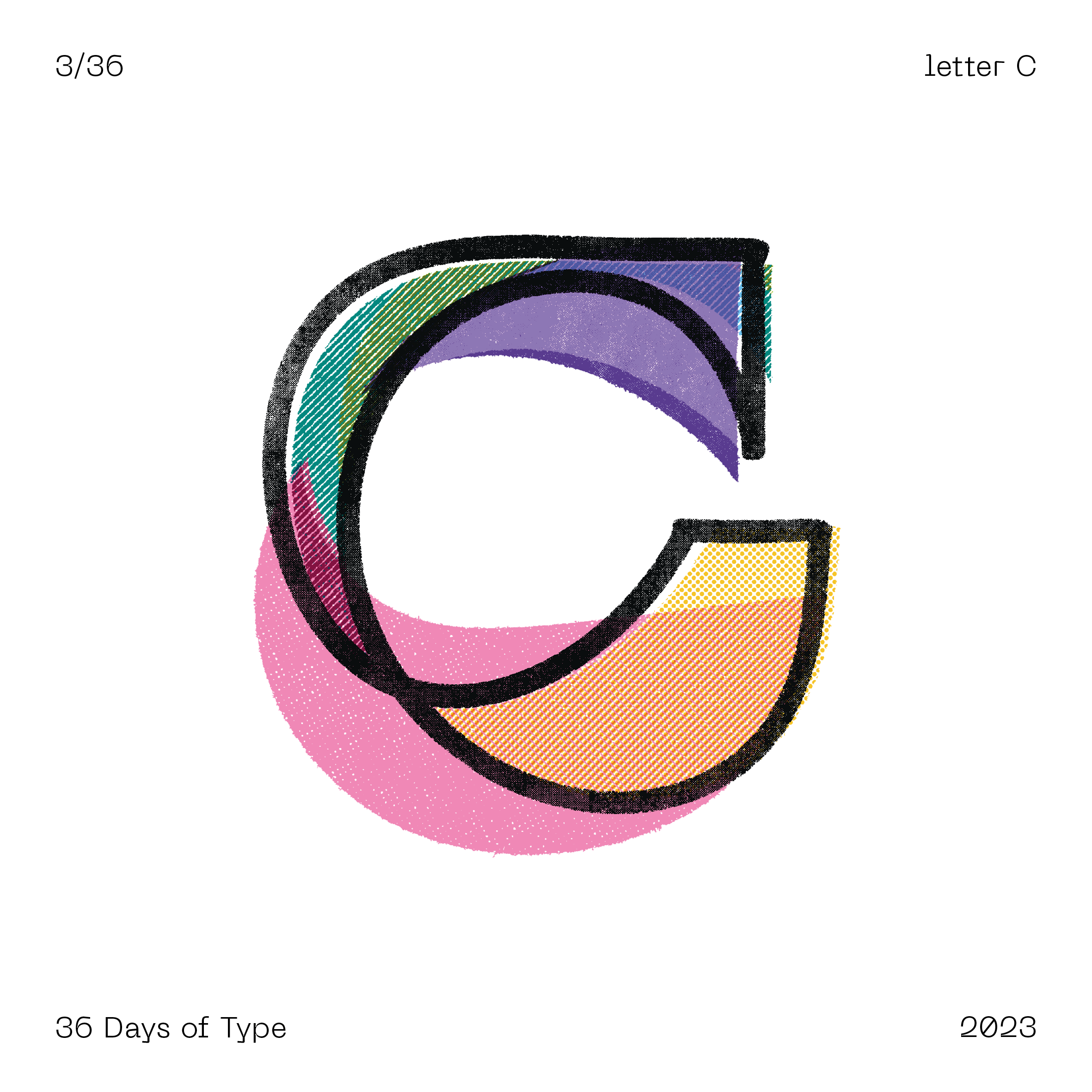
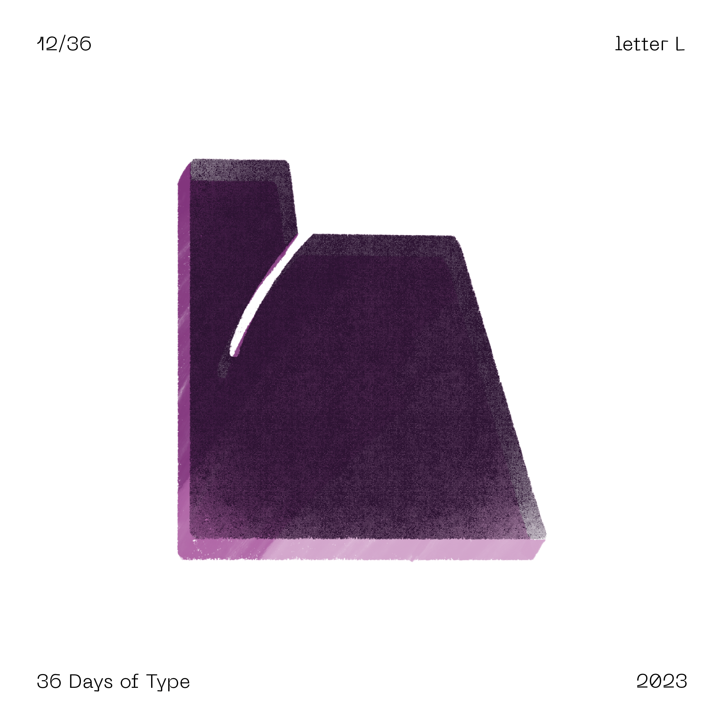
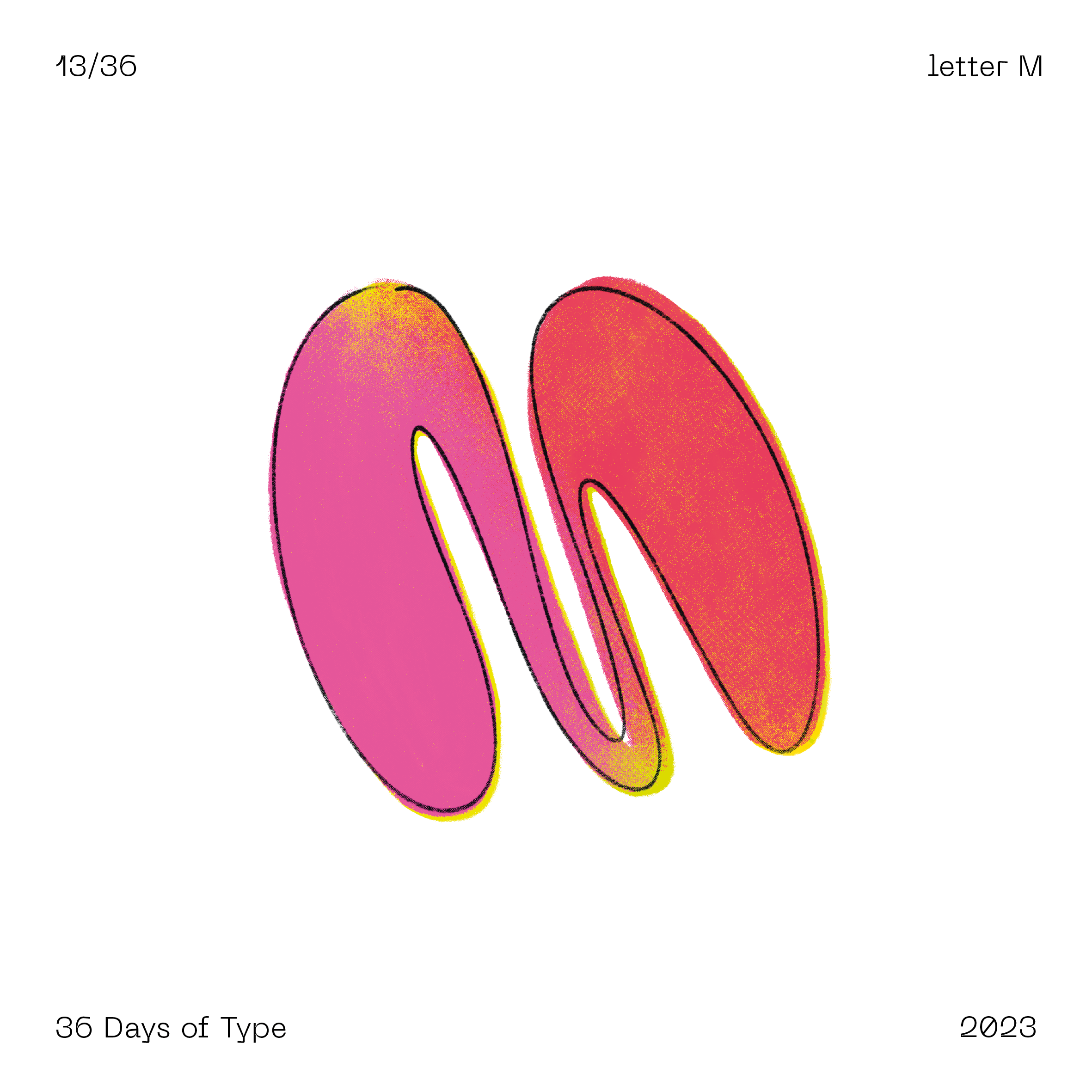
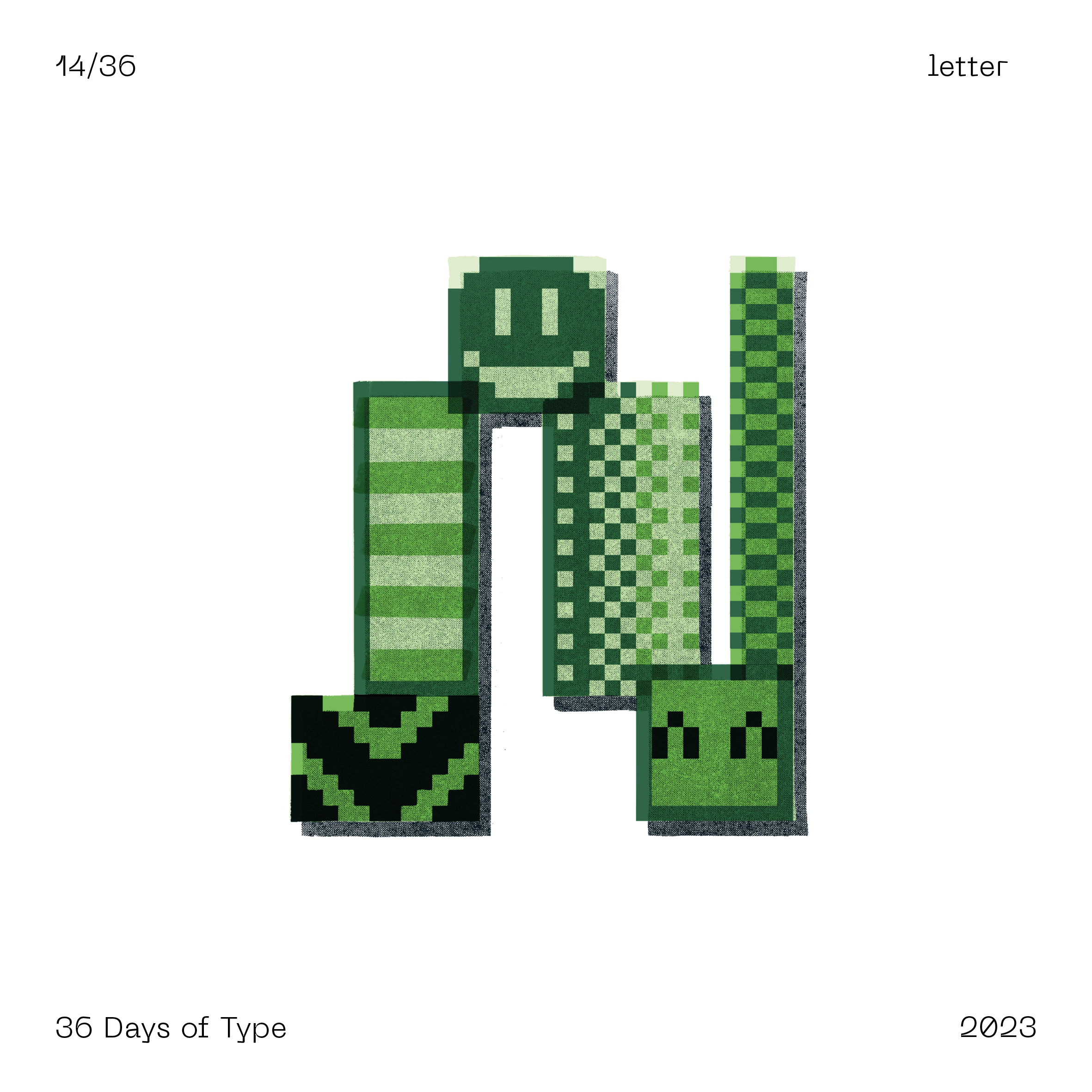
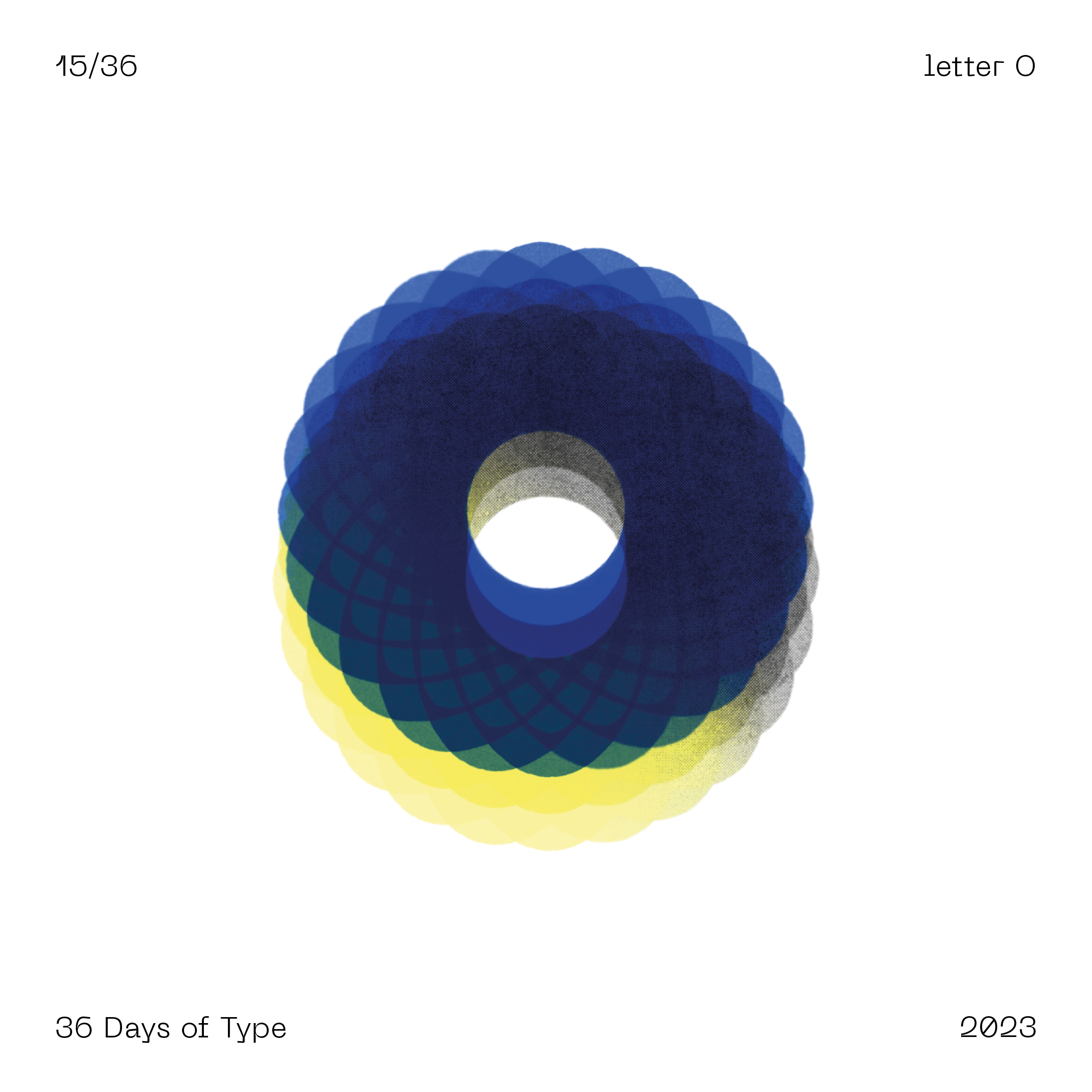
For me it was a first, not only in creating something new in such a short period of time, but also tackling type and characters head on. I exclusively used Procreate and drew each of the characters manually. Admittedly and since it was my first project of the sort, the visual style varies greatly from day to day, but the overall look remains that of screen printing with transparency. Sometimes I was inspired by blackletter, other times by isometric shapes or even pixel art. The learning curve was steep, but the end result is massively rewarding.