


Montreal Subway Line Maps
Year: 2016 / Client: hopefully the STM! / Tools: InDesign
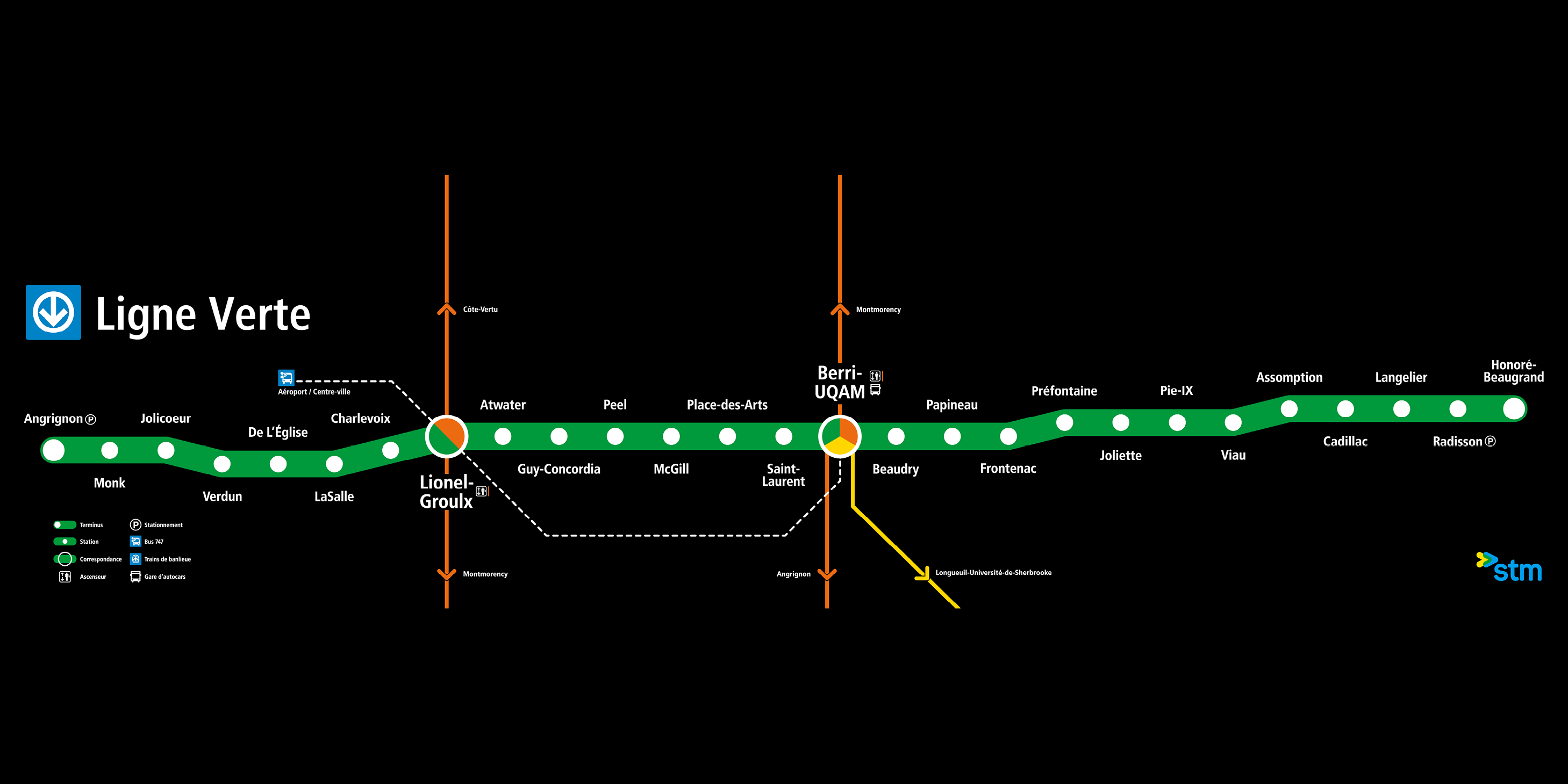
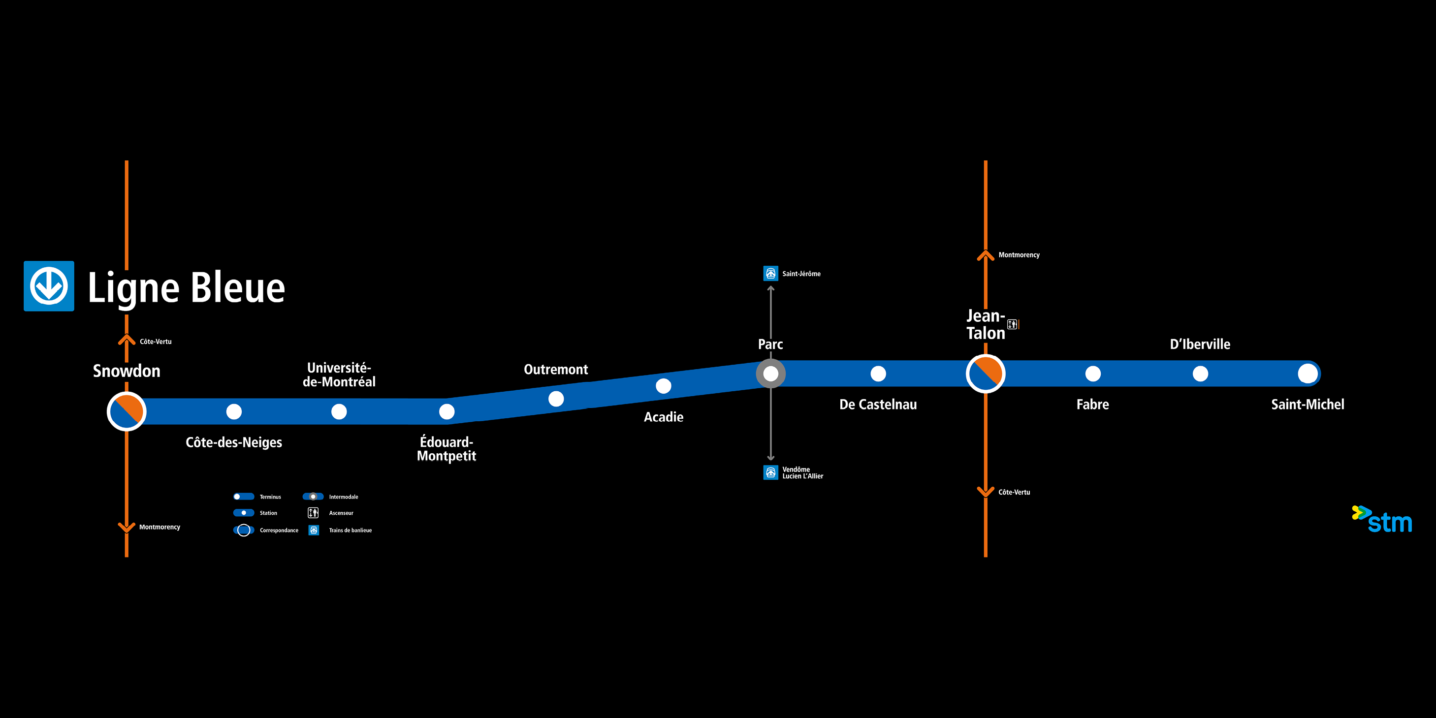
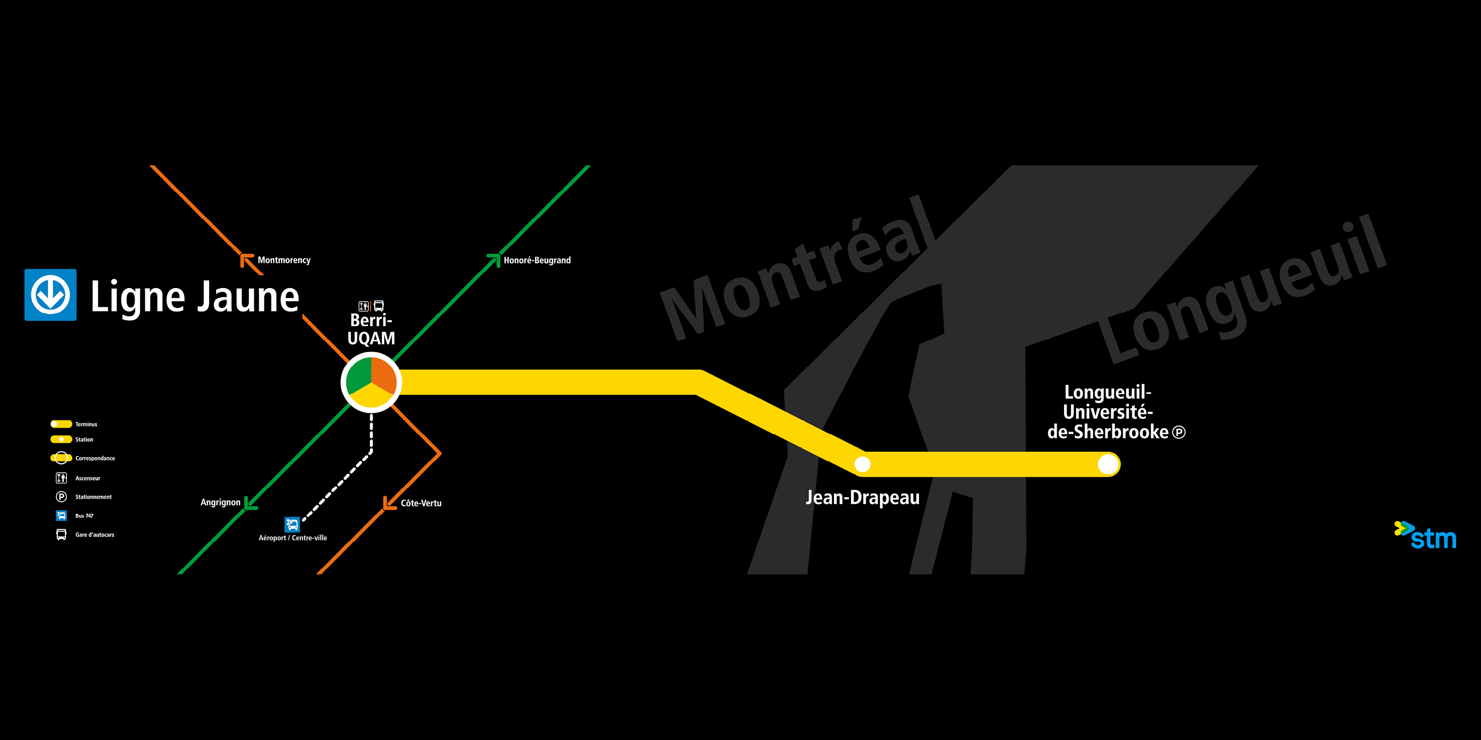
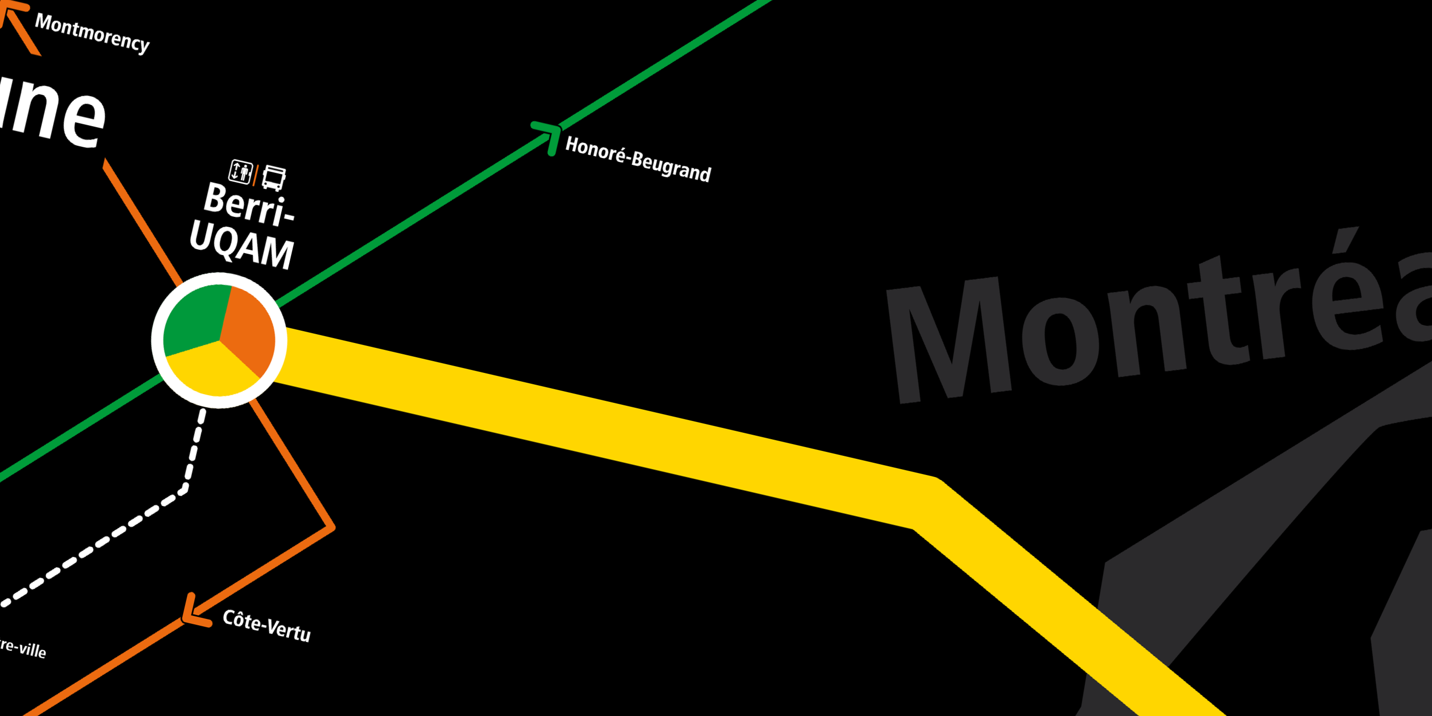
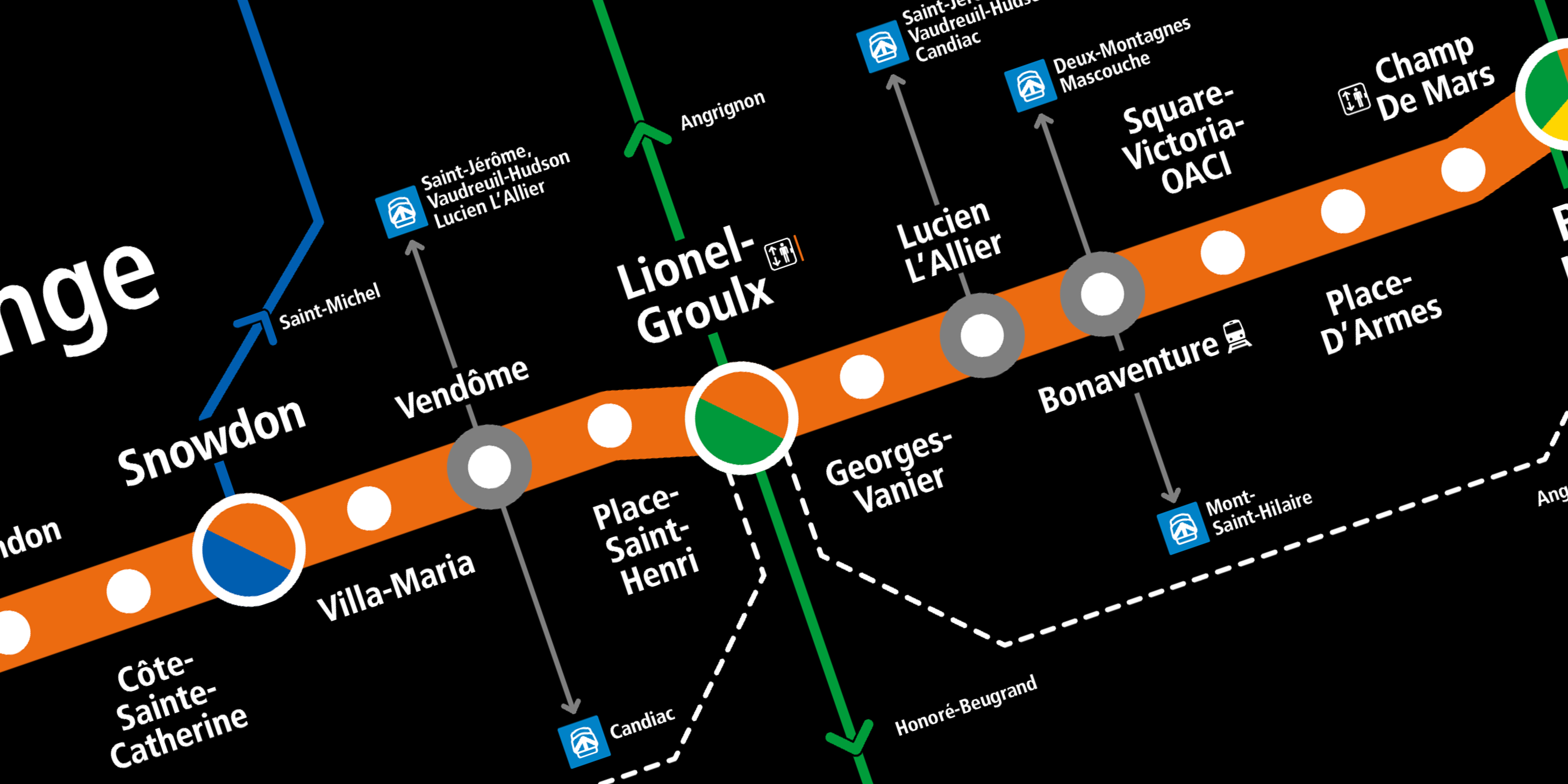
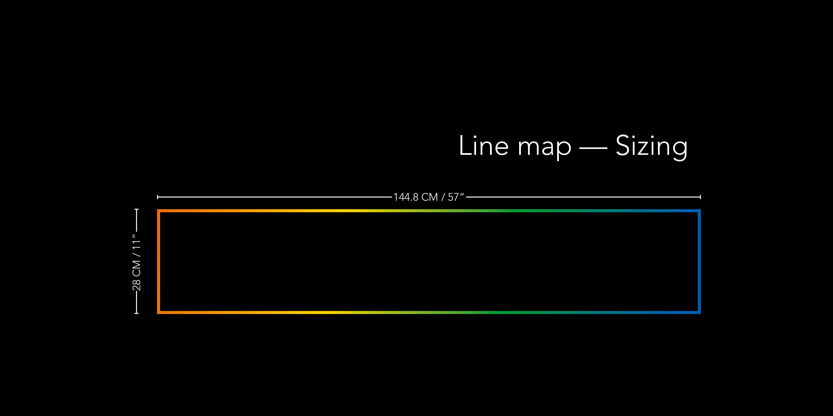
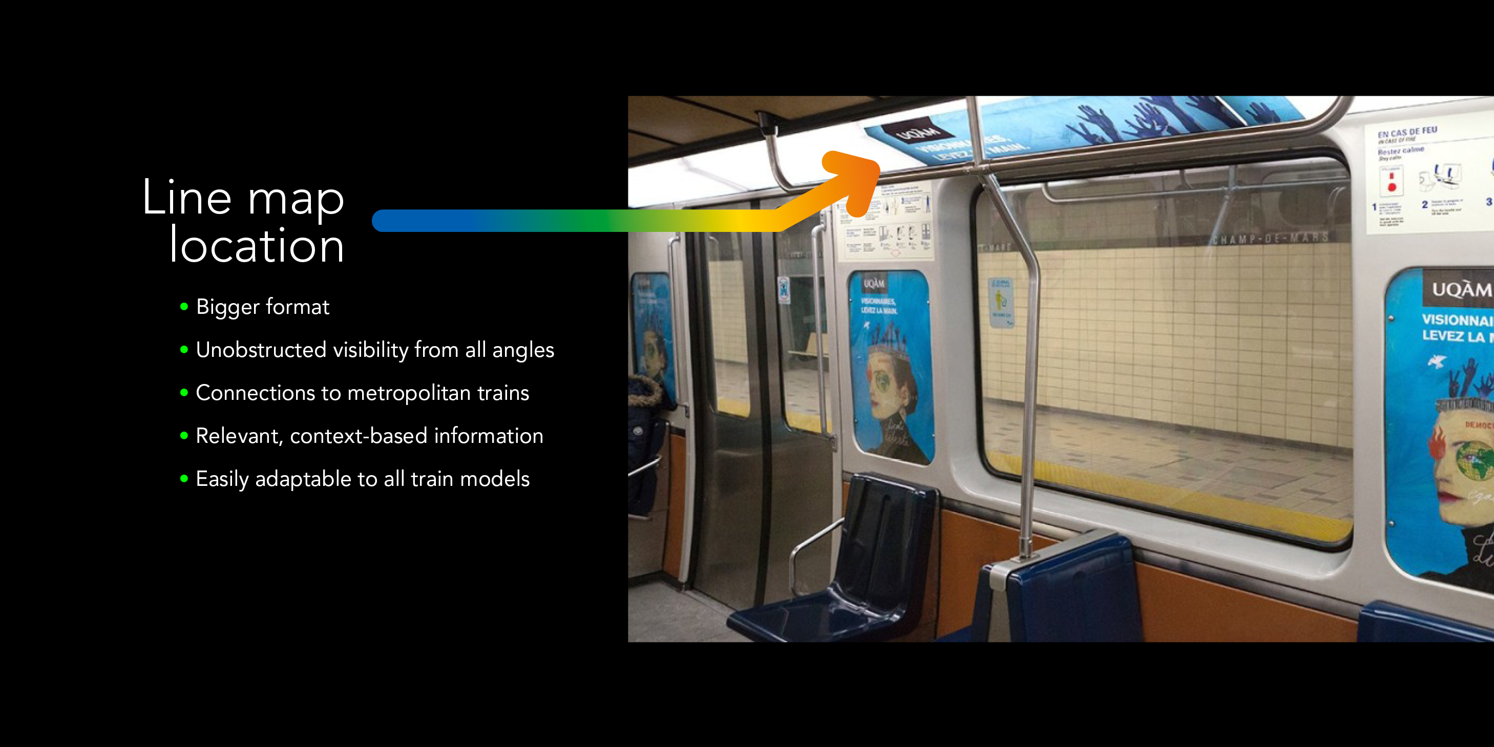
While using the Montreal metro system I noticed that the trains, even those newly introduced ones back in 2016, are lacking proper line maps like other metro systems. Ideally, these maps show the complete line with all the stations and their connections, in the same direction the train runs. They are placed horizontally along the length of the car and above the window frames so everyone can read them from most angles even when the train is full.
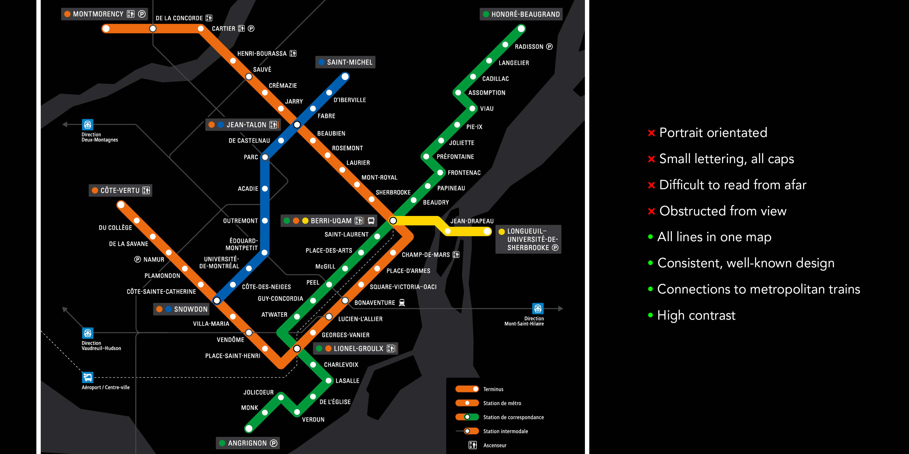
As with every other modern subway system, there are audio announcements on the train’s direction and what the next stop is, the station’s name is visible on the platform while on the train, but the maps on board to help passengers navigate the system are all vertical, printed with lots of information in a really small size to make for the lack of space, placed next to the doors and in most cases, on top of a seat.
The newly introduced trains partially solve this with screens that show the contextually appropriate information but still, a static piece of wayfinding such as a line map in all train models can make a difference in the commute of thousands of daily passengers like it does in subway systems in Mexico City, Paris or Moscow; in fact, the Art Levedeb design studio completely reworked the line maps for the Russian capital’s trains, and the final result was a major source of inspiration for this project.
Knowing how highly the Société de Transport de Montréal —STM— regards graphic design in their communication materials, I found it striking how their trains lack what is seemingly a ubiquitous staple of subway signage.
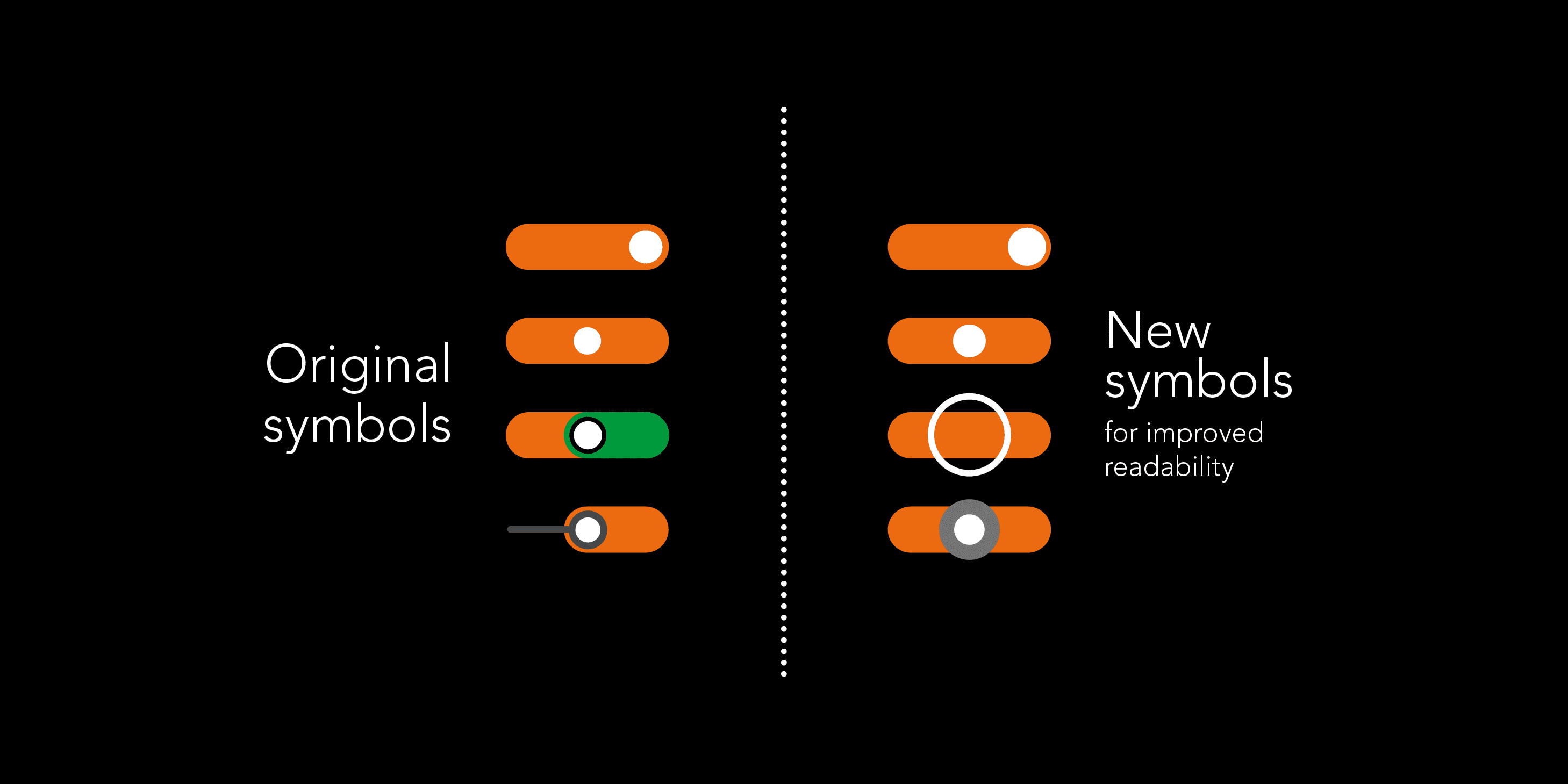
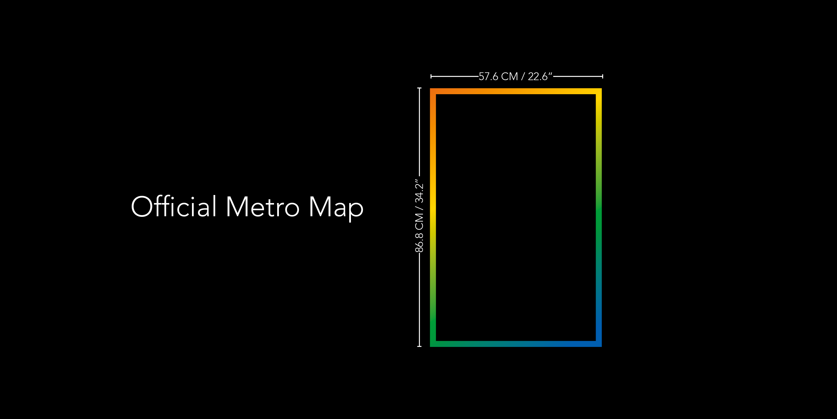
After asking the STM for the actual window frame sizes, I took the overall layout of each line and adapted it to a horizontal grid that fitted all four of them, revamped the symbol system for better readability and included what I considered the most essential information such as connection to regional trains, bus stations, airport links, handicap access and the like, without making the maps feel cluttered. Special care went into getting the type kerning & icon size right.
There are little nods to Montréal’s geography with the outlines of the St. Lawrence and Prairie rivers and the way each line turns in real life, without sacrificing legibility in the process.